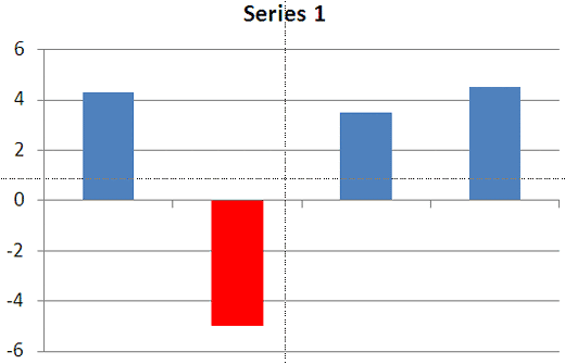
Change the white color used for negative values in chart series in PowerPoint 2010 and 2007 for Windows. You can choose to use another color such as red or something else that's better suited for your chart.
Author: Geetesh Bajaj
Product/Version: PowerPoint 2010 and 2007 for Windows
OS: Microsoft Windows XP and higher
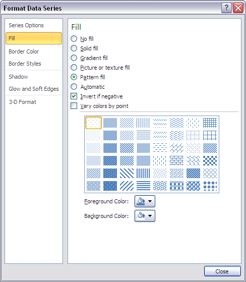
Although we mention that this tutorial works for both PowerPoint 2007 and 2010, the actual techniques work only within PowerPoint 2010 for Windows. The reason why this does not work well within PowerPoint 2007 is because that version had no option for pattern fills. However, if you work within PowerPoint 2010 using the procedure outlined on this page, you'll find that any changes you make show up in PowerPoint 2007 as well.
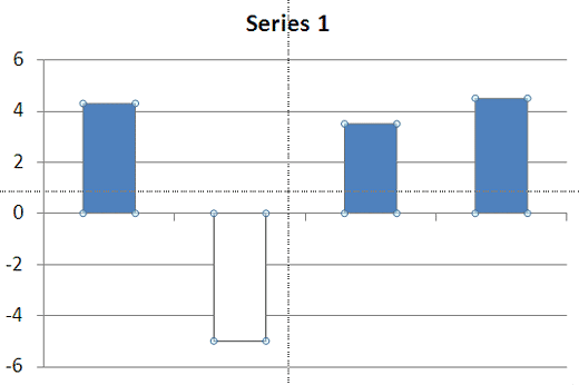
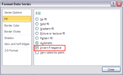
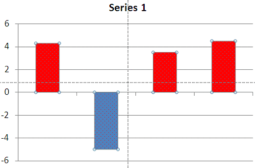
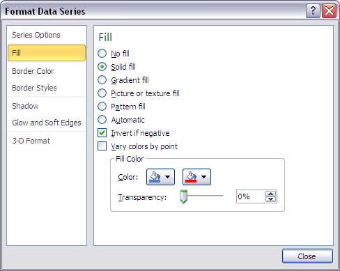
When you choose to invert the fill for any negative option in a chart series, you end up seeing those negative series in white. This is not a great default if your slide background is white or if you want the negative series to show in another color such as red. In this tutorial, we show you how you can use a workaround to get over this limitation.
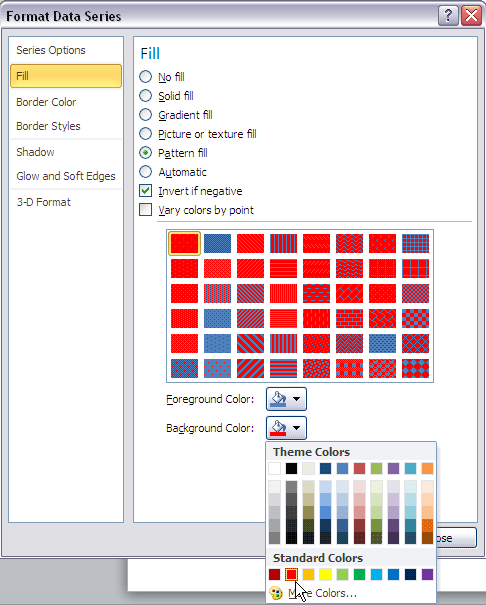
Follow these steps to change the of negative value representations in your charts in PowerPoint 2010 for Windows:

See Also:
Advanced Chart Techniques: Changing Color for Negative Data Series of Charts (Glossary Page)
Changing Color for Negative Data Series of Charts in PowerPoint 2013 for Windows
Changing Color for Negative Data Series of Charts in PowerPoint 2011 for Mac
Changing Color for Negative Data Series of Charts in PowerPoint 2003 and 2002 for Windows
You May Also Like: Viral Video In Two Steps: Presentation And Perseverance | Peanuts PowerPoint Templates


Microsoft and the Office logo are trademarks or registered trademarks of Microsoft Corporation in the United States and/or other countries.