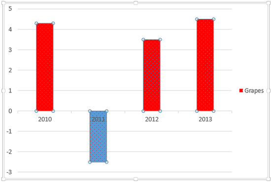
In PowerPoint charts, when you choose to invert the fill for any negative option in a chart series, you end up seeing those negative series in the default white color. This is not a great option if your slide background is white or if you want the negative series to show in another color such as red.
In this tutorial, let us explore how to get over this limitation using a workaround.
Follow these steps to change the color of negative value representations in your charts in PowerPoint 2013 for Windows:
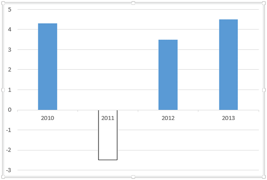
- Open your presentation and select the chart that has negative values with inverted fills, as shown in Figure 1, below.

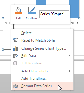
Figure 1: Chart with negative data series - Select the data series by clicking once on any of the columns, or within the chart elements drop-down list. Right-click on the data series to bring up the contextual menu as shown in Figure 2, below. Within this contextual menu, select the Format Data Series option, as shown in Figure 2. If you do not see the Format Data Series option in the contextual menu, you may have right-clicked on another chart element. Make sure you then deselect everything in the chart, and then right-click on any series (for example, a single column within a column chart).

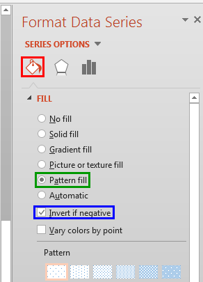
Figure 2: Format Data Series option - Doing so brings up the Format Data Series Task Pane as shown in Figure 3, below. Within this Task Pane, make sure that Fill & Line button is selected, as shown highlighted in red within Figure 3. Make sure that the Invert if negative check-box is selected, as shown highlighted in blue within Figure 3. Next, select the Pattern fill radio button, as shown highlighted in green within Figure 3.

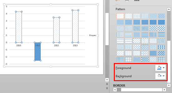
Figure 3: Pattern fill radio button selected within the Format Data Series Task Pane - As soon as you select the Pattern fill radio button, several patterns show up within the Format Data Series Task Pane as shown in Figure 4, below. You'll also find two color drop-down boxes under the pattern swatches, as shown highlighted in red within Figure 4. As you can see, the Foreground color matches the fill color for negative columns, and the Background color matches with the fill for positive columns.

Figure 4: Pattern fill - Now, let's make some changes. Within the Pattern section, choose the 5% Pattern (the top-left, first pattern), and then choose a solid color from the Background color drop-down, as you can see in Figure 5, below. Red was chosen since that color seems to go well with the negative concept.

Figure 5: Red color selected as the Background color - Figure 6, below shows how the chart looks now. As you can see, the colors of the columns are actually reversed from what we wanted! So we need to remedy that next.

Figure 6: Different column colors - Summon the Format Data Series Task Pane again. Within the Fill & Line button, choose the Solid fill radio button, as shown highlighted in red within Figure 7, below.

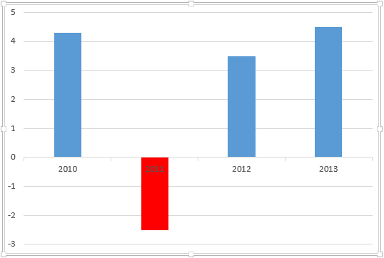
Figure 7: Solid fill radio button selected - Changing the fill type from Pattern to Solid fill sets colors in the chart series to the right values as shown in Figure 8, below. Note that the chart no longer has any pattern fill applied, and has distinctly different colors for positive and negative columns. As you can see in Figure 8, our sample chart has only one data series. However, there's no reason why you cannot use the same steps for any other series if your chart has multiple series.

Figure 8: Chart with changed colors - Save your presentation.
