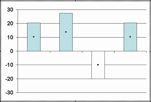
By default, both PowerPoint 2002 and 2003 use white as the fill color for negative series in your charts as shown in Figure 1, below. Yes, this does look very unimaginative and there's a workaround to get over this issue.

Figure 1: Negative value column
Follow these steps to change the color of negative value representations in your charts in PowerPoint 2003 and 2002 for Windows:
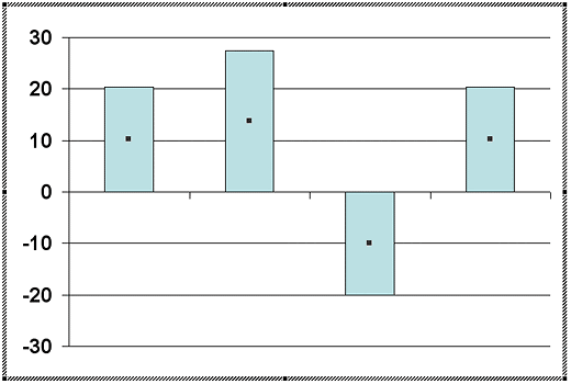
- You must have a chart that has negative values, as shown in Figure 2, below. Double-click the chart and then select the data series. If you have trouble selecting the data series, you can select any chart object from the Standard toolbar in chart editing mode.

Figure 2: Selected chart object - With the data series selected, choose the Format | Selected Data Series menu option, as shown in Figure 3, below.

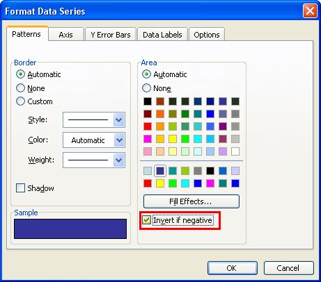
Figure 3: Format | Selected Data Series menu option - This action summons the Format Data Series dialog box, as shown in Figure 4, below.

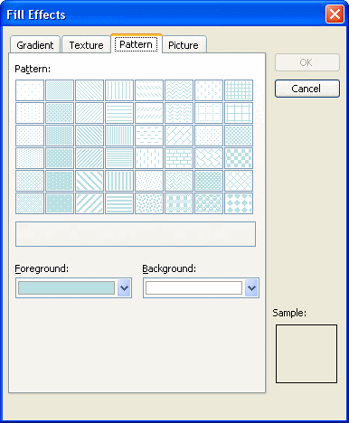
Figure 4: Format Data Series - Assuming you already chose the Invert if Negative option, as shown highlighted in red within Figure 4, above, now click the Fill Effects button to bring up the dialog box that you can see in Figure 5, below. Within this dialog box, choose the Pattern tab.

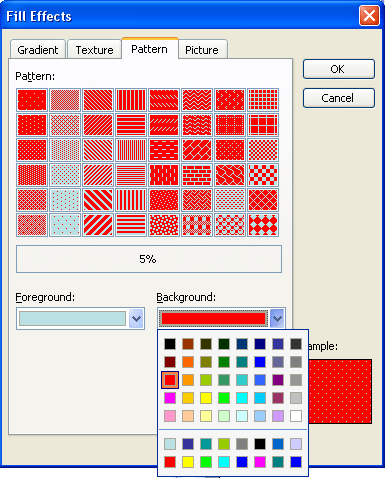
Figure 5: Pattern tab within Fill Effects dialog box - As you can see the foreground color matches the positive columns and the background color matches with the negative columns. Now we can change the background color to the desired color for the negative column.
- From the patterns choose the 5% pattern (the top-left, first pattern since this is the most inconspicuous pattern), and choose a solid color from the background color drop down, as you can see in Figure 6, below. We chose red since that goes well with the negative concept.

Figure 6: Background color - Apply changes by clicking OK in both Fill Effects and Format Data Sheet dialog boxes. Doing so gets you back to your chart.
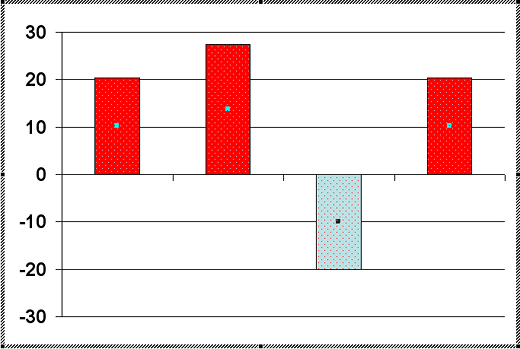
- Figure 7, below shows how the chart looks now. As you can see, the fill colors for the columns are different for positive and negative values. In fact, they are exactly the opposite of what we need.

Figure 7: Different column colors - Now, open the Fill Effects dialog box, as shown in Figure 5, previously on this page, and swap the foreground and background colors. Do note that there is no swap button and you will have to manually choose colors to swap. When done, click the OK button twice in successive dialog boxes. This action sets colors in the chart to the right values.
- However, the fill is still a pattern, and we can now remove that pattern too! To do so, you will need to make sure that this data series is selected. Next, bring up the familiar Format Data Series dialog box (see Figure 4), and select the required color for the positive column. Remember that any change in color you do now only changes the color of the positive columns, but it also does remove the pattern in the negative column! Click the OK button to apply.
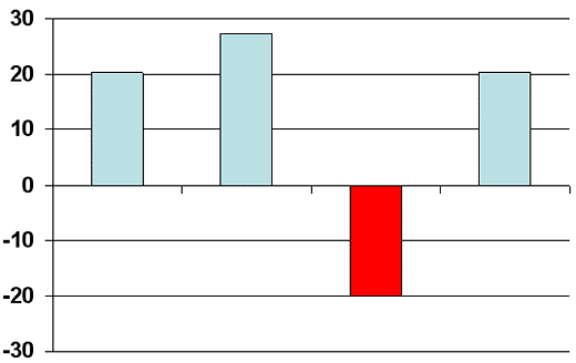
- Figure 8, below shows the correct chart with no patterns, and distinctly different colors for positive and negative columns. As you can see in Figure 8, our sample chart has only one data series. However, there's no reason why you cannot use the same steps for any other series if your chart has multiple series.

Figure 8: Chart with changed colors - You can exit the chart editing mode by clicking anywhere outside the chart area or the datasheet.
- Save your presentation.
