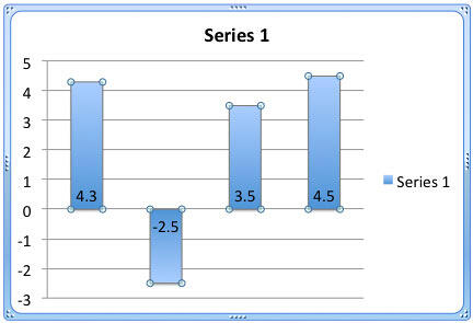
When you select the invert if negative option for a chart that has any negative data values in a series, you end up seeing those negative series with an inverted gradient fill (see Figure 1, later on this page). Since the difference between the gradient fills used for positive and negative values is negligible, you can show your negative series in a solid color that contrasts with the positive series. This color can be red, or any other color you choose.
Follow these steps to change the color fill of negative value representations in your charts in PowerPoint 2011 for Mac:
- Select the chart that has negative data values. For this chart, you would have already selected the invert if negative option, as shown in Figure 1, below. Select the data series by clicking on it. Alternatively, you can select the data series from the chart elements drop-down list.

Figure 1: Chart with Invert if Negative option selected - With the chart series selected, select either the Chart Layout or the Format tab of the Ribbon that you can see in Figure 2, below. Within any of these tabs, you will find the Current Selection group towards the extreme left as you can see in Figure 2. Within this group, make sure that the Chart Elements drop-down list, as shown highlighted in red within Figure 2, is displaying the name of the selected data series. Then, click the Format Selection button below it, as shown highlighted in blue within Figure 2.

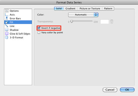
Figure 2: Click the Format Selection button with the correct data series selected - This action summons the Format Data Series dialog box. Make sure you have the Fill option selected in the sidebar and the Solid tab of this dialog box is active. You should see the same options as displayed in Figure 3, below. Also, ensure that you have already selected the Invert if Negative option, as shown highlighted in red within Figure 3.

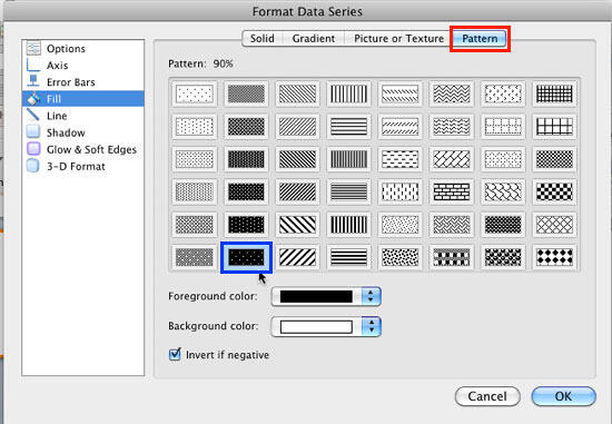
Figure 3: Format Data Series dialog box - To set a different color for a negative value series, we need to set Foreground and Background colors. This step involves an ironical detour to the Pattern tab of Format Data Series dialog box, as shown highlighted in red within Figure 4, below. Choose the pattern named 90%, as shown highlighted in blue within Figure 4. Doing so activates all options within the Pattern tab, as shown in Figure 4.

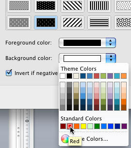
Figure 4: Options within Pattern tab - Now, choose a solid color from the Background color gallery that you can see in Figure 5, below. This color will be used as a fill for negative values. We selected red because it goes well with the negative value concept. Click the OK button to go back to your chart with new fills applied.

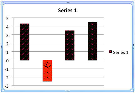
Figure 5: Background color selected for negative values - Figure 6, below shows how the chart looks. Now, we can optionally get rid of pattern fills applied and change the Foreground color.

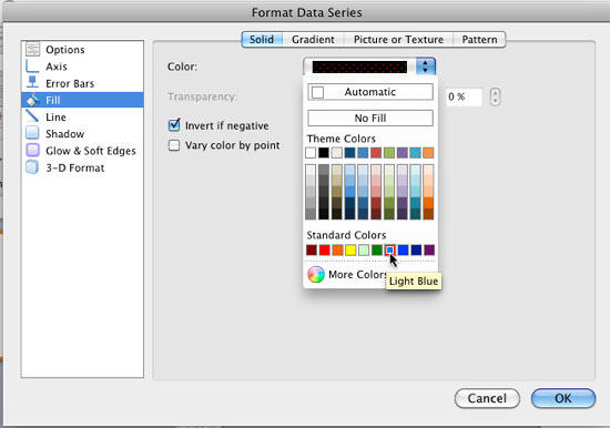
Figure 6: Columns with Pattern fill - Again, summon the Format Data Series dialog box, as explained in preceding steps. Make sure the Fill option is selected in the sidebar. Then, select the Solid tab. Open the Color gallery and select any other color for the positive values as shown in Figure 7, below. Do remember that the fill for your data series will no longer be a gradient, and will change to a solid fill. Click the OK button to apply the changes and get back to the chart.

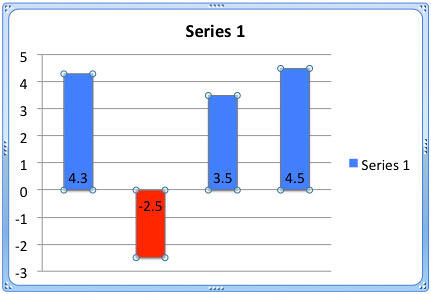
Figure 7: Solid fill being applied - Figure 8, below shows the final chart which has distinctly different colors for positive and negative data values. As you can see in Figure 8, our sample chart has only one data series. However, there's no reason why you cannot use the same steps for any other series if your chart has multiple series.

Figure 8: Chart with changed colors - Save your presentation.
