< Continued from Page 2
Bringing the Information Into Our Chart
Adding and Adjusting Data Labels
Continued on Page 4 >
Bringing the Information Into Our Chart
Now that we have calculated the numbers for our Waterfall chart, we want to replace the default data in our chart area at the top (cells A2:D6) with our own numbers. And to do this, we want to bring the numbers up as a dynamic range using formulas.
Why create dynamic ranges? That way, if we need to update anything in our chart, as we will do later on in this tutorial, we can simply update our original numbers down below, and the chart will update automatically.
You can start by changing the series labels at the top. So instead of Series 1, Series 2, and Series 3, in cells B1, C1, and D1, we'll type Base, Value, and Total.
- Creating the Dynamic Category Title Range: To create a dynamic range for the category titles, select A2 through A6 and type in the formula "=A10" and then holding the Ctrl key down, hit Enter to input the formula into the rest of the selected cells, as shown in Figure 1, below.
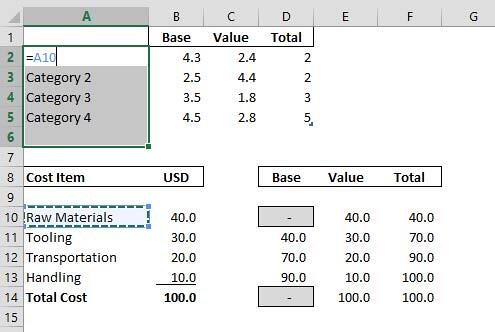
Figure 1: Selecting the Rows A2 through A6 - This brings the category titles into our chart as a dynamic range, as shown in Figure 2, below.
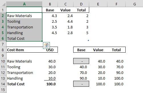
Figure 2: Resulting Dynamic Titles - That way, if we later change the category titles down below, our chart will automatically update.
- Creating the Dynamic 'Number' Range: To bring in the Numbers as a dynamic range using formulas, we'll need to repeat the last step. Select cells B2 through D6, type in "=D10", hold the Ctrl key down, and hit Enter to input the formula into the rest of the selected cells, as shown in Figure 3, below.
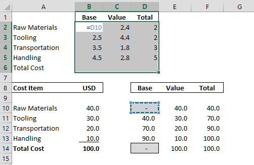
Figure 3: Selecting Cells B2 through D6 - Make sure to also format D2 through D6 so that they have one decimal point to match the other numbers, as shown in Figure 4, below.
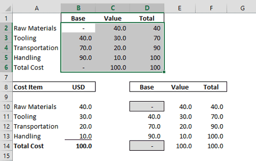
Figure 4: Numbers with one decimal point - Moving Back to PowerPoint: With the Excel spreadsheet now completed, close Excel by hitting Ctrl + W, or simply clicking the Close button at the upper-right hand corner of the sheet, and return to PowerPoint. Within PowerPoint, your chart should look like what you see in Figure 5, below.
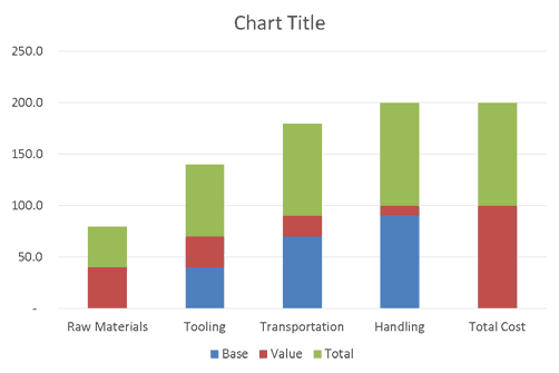
Figure 5: Chart with applied values
Back
Adding and Adjusting Data Labels
Although the chart doesn't look like much yet, we now have all the elements we need to create our Waterfall chart here in PowerPoint.
- Adding Data Labels to the Total: As a first step, we want to add data labels to the Total columns. So right-click the green data series so that all of the green columns are selected, and in the right-click menu, select Add Data Labels, as shown in Figure 6, below.
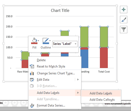
Figure 6: Adding Data Labels to the green Series 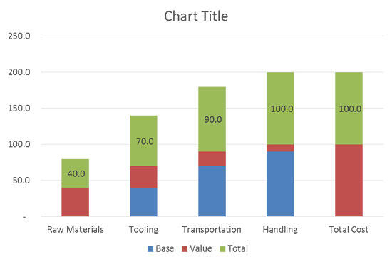
Figure 7: Resulting green series Data Labels - Adding Data Labels to the Value: Next, we want to add Data Labels to the Value column. So right-click the red data series so that all of the red columns are selected, and in the right-click menu, select Add Data Labels, as shown in Figure 8, below.
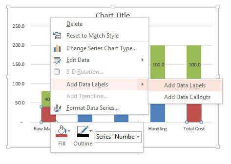
Figure 8: Adding Data Labels to the red Series 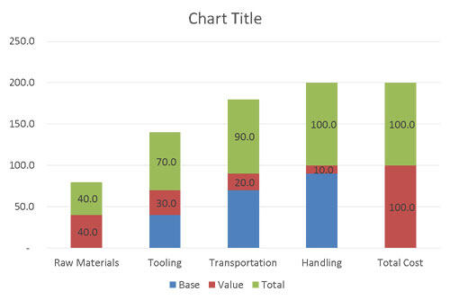
Figure 9: Resulting red series Data Labels - Adjusting the Data Labels: Now, although this looks okay, we actually want the Total column's Data Labels to sit directly on top of the Value column. So right-click the Total column's Data Labels so that all of the Data Labels are selected, and select Format Data Labels, as shown in Figure 10, below.
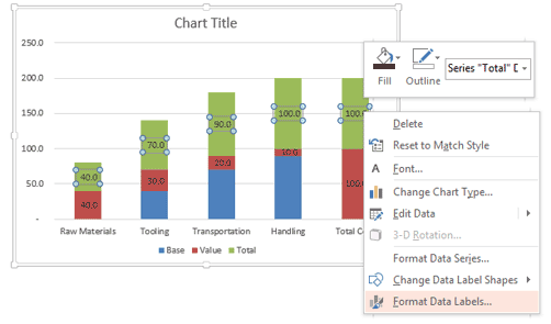
Figure 10: Select the green series Data Labels - Within the Format Data Labels Task Pane that opens, under Label Position, select the Inside Base radio button, as shown in Figure 11, below, and then close the Task Pane.
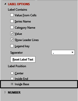
Figure 11: Selecting Inside Base - Let's also make the Total column's Data Labels stand out as totals by making them bold. Select the Total column's Data Labels, and hit Ctrl + B on your keyboard.
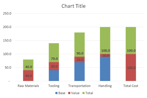
Figure 12: Resulting Formatted Data Labels
Back
Formatting the Column Chart, continued on Page 4 >