Learn more about Waterfall charts in PowerPoint. We also look at suitable data, and how waterfall charts can be created in PowerPoint.
Author: Geetesh Bajaj
Product/Version: PowerPoint
OS: Microsoft Windows and Mac OS X
Waterfall charts may sound complicated, but they are among the easiest charts to understand. Just like a story that builds up layer by layer, the columns in these charts guide us through rising and falling numbers. It's almost as if you are on a journey, and by the time you reach your destination, you've understood the story hidden within the data.
So, what is a waterfall chart? Where are these charts used, and what sort of data are they best suited for? These are the types of questions most chart users would want answers to. And that’s why we created this plain English guide to waterfall charts.
What are Waterfall charts?
What’s in a name?
What is the type of data best suited for Waterfall charts?
How did Waterfall charts originate?
What are the unique components of a Waterfall chart?
Figure 1, below, shows a simple waterfall chart.
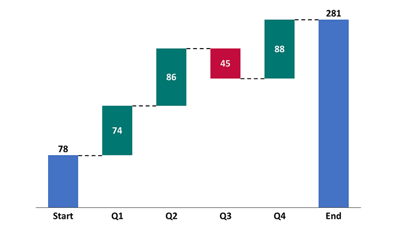
Figure 1: Sample waterfall chart
To fully understand what a waterfall chart is and how it's used, let's explore both logical (left-brained) and creative (right-brained) explanations:
Left-Brained Explanation: A waterfall chart visually breaks down the cumulative effect of sequentially introduced values. Positive values are represented by rising columns and negative values use falling columns. Such charts are great for showing how an initial value is affected by a series of intermediate values, leading to a final value.
Right-Brained Explanation: Imagine a cascading waterfall. Each step shows how different elements (like costs, revenues, or other factors) add up or subtract from the total, giving you a clear visual story of changes over time or categories. So, rather than showing only the starting and ending values in a chart, you get to see net changes happening along the way.
By combining both these perspectives, you'll get a complete picture of what waterfall charts are and how they can be useful for your data visualization needs. We’ve attempted to visualize both of these definitions in Figure 2, below.

Figure 2: Left and right brained definitions of a waterfall chart
You can create waterfall charts within newer releases of PowerPoint or using an add-in such as think-cell. Here are links to complete tutorials that teach you how to create waterfall charts, step-by-step:
Waterfall Charts in PowerPoint 365 for Windows
Waterfall Charts using think-cell add-in for PowerPoint
Waterfall charts represent data sequentially in columns that can go up and down compared to the previous column. This means that the position of any data value you add relates to the previous data value.
Let us assume that the waterfall chart shown in Figure 1 was an inventory chart that explains how many units were available in your company’s warehouse. We could say that we started with 78 units and ended with 281. But that explanation would not present a story, where we could see that we sourced more units in the first, second, and fourth quarters. However, most of the sales happened in the third quarter, which can be explained by a dropping inventory column in Figure 1, above. Looking at the entire story, it’s obvious that this business needs to ensure that they source fewer units unless they are going to see a huge surge in sales.
Yes, our story was a little simplistic. We only had four quarters, and your data may span 52 weeks. That’s not a problem because waterfall charts can tell more detailed stories by adding more columns to show further relationships between factors. Plus, you can also use stacked waterfall charts to summarize multiple factors in one cohesive visualization.
BackNow, let’s learn why this type of chart is known as a waterfall chart. You’ll know the answer when you look at a sample waterfall chart in Figure 1, again. Note that each column looks like a stream of a larger waterfall. Let's look at a picture of a real waterfall in Figure 3, below.

Figure 3: A real waterfall
Image: Yay Images
Now, real waterfalls are of many types, and we will not get into details of waterfall elements. However, for the benefit of our comparison, you will notice that individual waterfall streams look like columns in a waterfall chart. This is a very broad comparison, and we only raised this analogy so that you know why this chart type is named after the cascading appearance of the columns, which resembles a waterfall. Each column in a waterfall chart represents a change in a certain value.
Now, let us visualize a chart superimposed on a picture of the same waterfall, as shown in Figure 4, below. Notice that it looks like a waterfall chart.

Figure 4: Superimposed columns on a waterfall
Why are we referring to the individual streams in waterfall charts as columns? Why not call it bars, like many other chart artists do? That’s because Microsoft PowerPoint does refer to standing bars as columns. It also refers to sleeping bars as bars, and we will use the same terminology to make matters as uncomplicated as possible.
Waterfall charts are also known as cascade or bridge charts. Typical uses include:
Waterfall charts are best suited for data that involves a sequence of changes in a single value over time. For example, this could be the changes in a financial balance or a quantity of a product in an inventory. It’s a given prerequisite that the data should indicate changes that can be added or subtracted from a starting value to arrive at an ending value.
For the same reason, waterfall charts are not well-suited for any complicated data that involves multiple variables that change over time. Such data would not show the relationships between variables. In these cases, other types of charts, such as line, column, or bar charts may be more suitable.
BackThere is no recorded origin of waterfall charts, and their first-ever use is also not documented. However, it is believed that they first emerged in the early 1990s as a tool for financial analysts to represent changes in balance sheets and income statements. The purpose of the chart was to provide a visual representation of the changes in a financial value over time, such as the growth or decline of a company's revenue or assets.
One of the largest users of waterfall charts was McKinsey and Company, the well-known consulting firm.
Since their inception, waterfall charts have been adopted by a wide range of industries and have become a common tool for visualizing changes in values. The chart's ability to show the cumulative effect of sequentially introduced positive or negative changes has made it a popular choice for a variety of applications, including financial analysis, project management, and performance tracking.
BackA waterfall chart is unique because it has some components that most other charts do not include. These components, as shown in Figure 5, below.
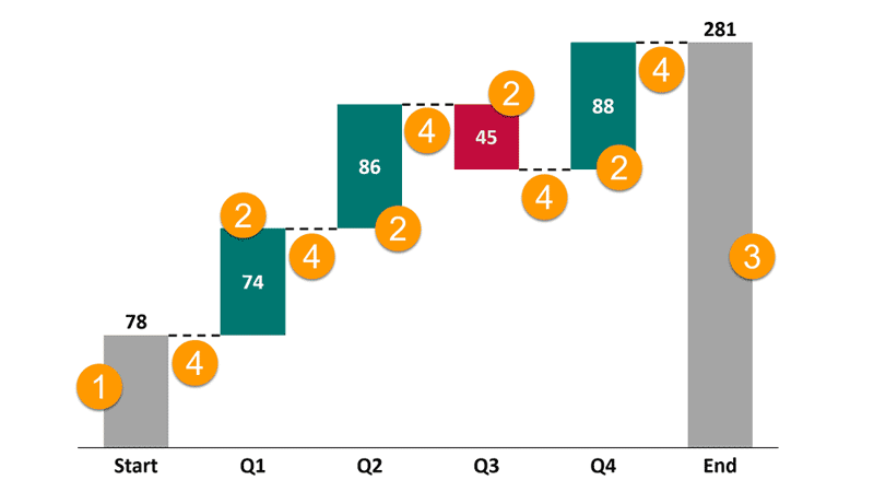
Figure 5: Components of a waterfall chart
We will only look at the elements that are unique to waterfall charts (and we'll skip over descriptions of axes, data labels, legends, etc.).
Build-up waterfall charts are best for showing chronological stories and are often the easiest way to tell your story. Build-down waterfall charts start with the end result as the first column, and have each factor's column afterwards. We'll look at the unique components of a build-up waterfall chart, as marked in Figure 5, above:
This is the opening value, such as the company revenue, inventory stock, or employee count at the beginning of our time span. The starting value is represented by the first, leftmost column in the waterfall chart, and is typically filled with a neutral color.
These are the additions or reductions made to the starting value and show up as rising or falling columns. Typically, rising columns are colored green or black, and fallen columns are colored red or white. However, some companies like to use their brand colors.
This is typically the last and rightmost column that shows the value adjusted for all additions and reductions made. Like the Start value column, this one is also filled with a neutral color.
At the very basic level, connectors are lines that connect the columns and indicate the flow of data from one value to the next. Connectors start at the final value of the prior column and end at the starting value of the following column. In other words, they show you how data moves from point A to point B. They are especially helpful in stacked waterfall charts, where each column represents multiple factors. We will look at stacked waterfall charts in a subsequent article.
In addition to the components explained above, you can also add any number of Total value columns in between. You’ll notice a Total column named Halfway between two quarters in Figure 6, below. The Total columns work the same way as the Final value column but are placed along with the In-between value columns. They typically are colored neutral, in the same way as the Start value and Final value columns.
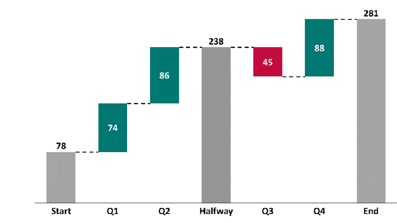
Figure 6: Total column added to the chart
10 14 14 - PowerPoint Chart Types: Waterfall Charts in PowerPoint (Glossary Page)
Waterfall Charts in PowerPoint 365 for Windows
Waterfall Charts using think-cell add-in for PowerPoint
Stacked Waterfall Charts using think-cell add-in for PowerPoint
Stacked Waterfall Charts in PowerPoint
You May Also Like: Preparation Before Speaking: Conversation with Nigel Holmes | Black Currant PowerPoint Templates


Microsoft and the Office logo are trademarks or registered trademarks of Microsoft Corporation in the United States and/or other countries.