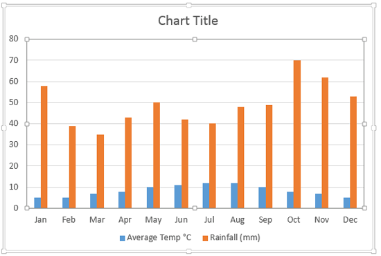
Sometime, one value axis for a chart is not enough! The sample data that we took for this tutorial pertains to the average temperature and rainfall in London across the 12 calendar months of a year. Figure 1 below shows a chart that depicts this data from January to December. The temperature is depicted in degrees celsius and the rainfall is in millimeters. What you should note carefully is that the value range of temperature spans between 0 to 12 (approximately) whereas the range for rainfall is between 30 and 70. A chart that results from this data doesn't live up to the comparison since we are trying to compare items that are from different data ranges.

Figure 1: Chart with two data series
To help your audience comprehend this data better, you could create two charts. But that's an overkill since there's a better, more elegant solution. You should span this data on two value axes within the same chart: one for the temperature and the other for the rainfall.
Follow these steps to add a secondary value axis to your chart in PowerPoint 2013 for Windows:
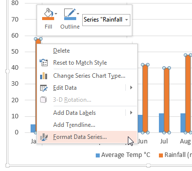
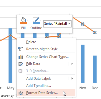
- Open your presentation and navigate to the slide that contains your chart. Within the chart, select the series to which you want to add a second value axis. Right-click this series to access the contextual menu, as shown in Figure 2, below. From this contextual menu, choose the Format Data Series option.

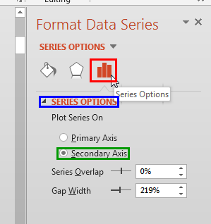
Figure 2: Format Data Series option selected - This step opens the Format Data Series Task Pane, as shown in Figure 3, below. Make sure that the Series Options button is selected as shown highlighted in red within Figure 3. Then, select the Series Options (highlighted in blue within Figure 3) within the Format Data Series Task Pane. Thereafter, select the Secondary Axis radio button, as shown highlighted in green within Figure 3.

Figure 3: Secondary axis radio button selected for one of the series - This action adds a secondary value axis that maps your selected series, as shown in Figure 4, below. Note that axis labels on both the value axes show different numbered ranges. The primary value axis displays minimum and maximum values between 0 and 14, and the secondary value axis spans a completely different range between 0 and 80.

Figure 4: Secondary value axis added - We might have solved the problem of comprehending actual values better now, but we have a new problem to solve! As you can see in Figure 4 above, one data series is overlapping the other. Columns depicting rainfall are completely hiding most of the columns representing the average temperature.
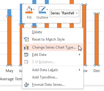
- To solve this problem, you need to change the chart type of any one of the series. Select the series that you want to change the type of, and right-click to access the contextual menu, as shown in Figure 5, below. From the contextual menu, choose the Change Series Chart Type option (refer to Figure 5 again).

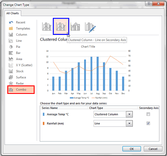
Figure 5: Change the chart type of selected series - Doing so brings up the Change Chart Type dialog box as shown in Figure 6, below. Select the Combo option as shown highlighted in red within Figure 6 and then click on the Clustered Column - Line on Secondary Axis variant type, as shown highlighted in blue within Figure 6. Click the OK button.

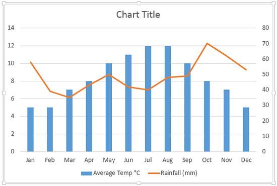
Figure 6: Change Chart Type dialog box - This action changes the selected series to the new chart type. In Figure 7, below you can see that the series representing rainfall has changed to a Line.

Figure 7: Chart type changed - Your chart at this stage needs little more modification since there are no markers visible on the point to represent the value. To make the marker visible, right-click the data series represented by line, and from the contextual menu select the Format Data Series option.

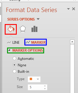
Figure 8: Format Data Series option selected - Doing so opens the Format Data Series Task Pane, as shown in Figure 9, below. Make sure that the Fill & Line button is selected as shown highlighted in red within Figure 9. Then, select the Marker tab, highlighted in blue within Figure 9 in the Format Data Series Task Pane. Thereafter, select Marker Options, as shown highlighted in green within Figure 9.

Figure 9: Marker options within the Format Data Series Task Pane - This step reveals various options to format the Marker as shown in Figure 10, below. Select the Built-in radio button, shown highlighted in red within Figure 10. Then click the down-arrow provided with the Type option, as shown highlighted in blue within Figure 10, to open the Type drop-down menu that contains various Marker types, as shown in Figure 10. Click on the Marker type of your choice.

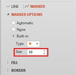
Figure 10: Marker type selected - You can also change the size of the marker. In Figure 11 you can see that we have set the Size value to 10.

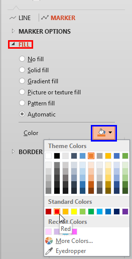
Figure 11: Marker size set to 10 - Then, optionally change the color of the Marker to make it stand apart on the line. To do that, select the Fill option (highlighted in red within Figure 12) within the Marker tab and click the Color button (highlighted in blue within Figure 12) to open the Color drop-down gallery that contains various color palettes, as shown in Figure 12. Click on the color palette of your choice. The options within the Color drop-down gallery are explained further in our Apply Solid Fills to Plot Area of Charts in PowerPoint 2013 tutorial. Even though the tutorial is specific to Plot Area, they pertain to Markers as well, refer to Step 4 within that tutorial.

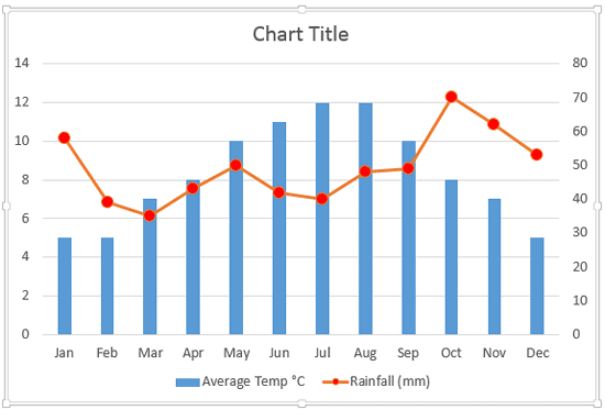
Figure 12: Select a color for the marker - This adds markers to the line representing the secondary axis data values, as shown in Figure 13, below.

Figure 13: Markers added to the line representing the secondary axis data values - Creating a combination chart of this type with two series makes your data appear so much better, and it also ends up being so much easier on the eye for your audience. You cannot compare apples and oranges, but they can still coexist!
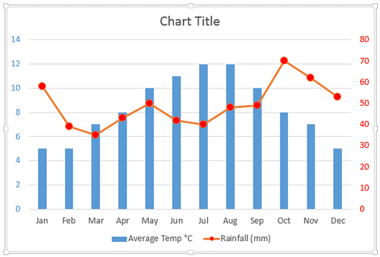
- If you try to analyze the chart shown in Figure 13 above, you will realize that there's no easy way to identify if a particular series uses the Primary axis or the Secondary axis. With just two series, this is an easy problem to solve. We just changed the text fill color of both the axes labels to match the color of the respective series and marker points, as shown in Figure 14, below (compare Figures 13 and 14).

Figure 14: Font color changed for the secondary axis labels - Save your presentation.
