Learn more about stacked waterfall charts in PowerPoint. Stacked waterfall charts are an evolution of the conventional waterfall chart.
Author: Geetesh Bajaj
Product/Version: PowerPoint
OS: Microsoft Windows and Mac OS X
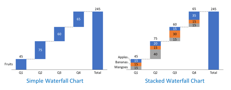
In a previous article, we looked at waterfall charts. A simple waterfall chart contains just one parameter, represented by one series in your data. Such a chart is useful because it’s instantly intuitive, not to mention extremely powerful as a data visualization tool. A simple waterfall chart can be seen on the left in Figure 1, below.

Figure 1: Simple or stacked
As you can see, this chart talks about the quantum of fruit sales by a large grocery chain, and its objective is clear to the audience. Yet, it doesn’t offer a break-up of the three fruit types that are sold by the grocery chain. This problem is rectified by the stacked waterfall chart on the right within Figure 1, above, that details sales of apples, bananas, and mangoes.
Each column within the waterfall chart is stacked, and this chart tells a better story than the one on the left.
What can you learn from this story? Here are some thoughts:
As you can see, you can find a much more interesting story with stacked waterfall charts compared to non-stacked, single series, waterfall charts.

Figure 2: Visualization of a stacked waterfall chart
Yes, stacked waterfall charts add a whole new dimension to data visualization. We will learn more about stacked waterfall charts and explore more example scenarios to understand where they are best used.
Stacked waterfall charts are a variation of the traditional waterfall chart that provide you with an option to break down intermediate values into subcategories and show how they contribute to overall metrics. These intermediate values can be both positive and negative, and individual columns within the chart will show the overall value.
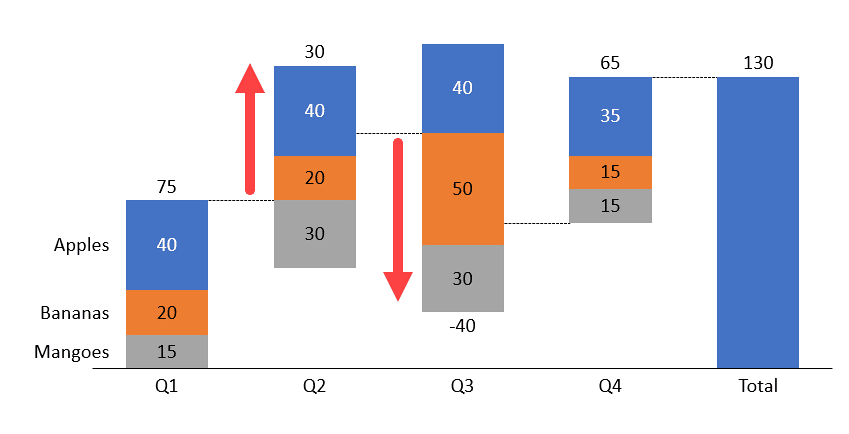
For example, if our values for a column were +40, +20, and -30, the overall column value would be +30, as can be seen within Figure 3, below. You will notice that since the overall value of +30 is positive, the column will be rising upwards compared to the previous column. This is obvious from the column rising above the connector, as indicated by the up arrow in Figure 3.

Figure 3: Impact of negative and positive values in a column
Similarly, if our values for a column were +40, 50, and 30, the overall column value would be 40, as can be seen within Figure 3, above. Notice that the overall value of 40 is negative, and this is reflected as a column falling downwards compared to the previous column, as indicated by the down arrow in Figure 3.
Stacked waterfall charts can be a useful tool for visualizing complex data sets and identifying trends and patterns in the data. These variations make the overall story that you want to share with your audience much more interesting.
Creating a stacked waterfall chart in PowerPoint is difficult because the native waterfall chart option in PowerPoint does not support stacked columns.
Really speaking, most chart designers would only create a stacked waterfall chart in PowerPoint if faced with a challenge, or if they had no other option. Of course, a few of them may not know that there are alternative options such as think-cell available.
As a proof of concept, you would need to start with a combination of basic chart types and then do extensive manual formatting to create a stacked waterfall chart in PowerPoint. And if you need to make changes to your chart, consider spending a lot of time doing the manual formatting again.
Otherwise, if you have access to a charting tool like think-cell, it can simplify the process of creating stacked waterfall charts in PowerPoint. Learn more in our Stacked Waterfall Charts using think-cell add-in for PowerPoint tutorial. Now, you can create stacked waterfall charts directly within PowerPoint using a simple drag-and-drop interface and think-cell will take care of the formatting and calculations for you.
10 14 14 - PowerPoint Chart Types: Stacked Waterfall Charts in PowerPoint (Glossary Page)
Waterfall Charts in PowerPoint 365 for Windows
Waterfall Charts using think-cell add-in for PowerPoint
Stacked Waterfall Charts using think-cell add-in for PowerPoint
Waterfall Charts in PowerPoint
You May Also Like: Do You Buy Stock Photos for Clients? | Headache PowerPoint Templates


Microsoft and the Office logo are trademarks or registered trademarks of Microsoft Corporation in the United States and/or other countries.