Waterfall charts do portray figures and numbers, but they also tell a story over a period. These stories relate to anything from inventories to staffing and sales to profits. While older versions of PowerPoint did not support creation of waterfall charts natively, newer versions can create some amazing waterfall charts.
In this tutorial, we will explore creating waterfall charts in PowerPoint 365 for Windows, and will then look at some limitations that can be overcome with a third-party PowerPoint add-in.
Creating Waterfall Charts in PowerPoint
Limitations of Creating Waterfall Charts in PowerPoint
Creating Waterfall Charts in PowerPoint
Follow these steps to insert a waterfall chart in PowerPoint 365 for Windows:
- Launch PowerPoint and access the Insert tab of the Ribbon. Click on the Chart button, as shown highlighted in red within Figure 1, below.

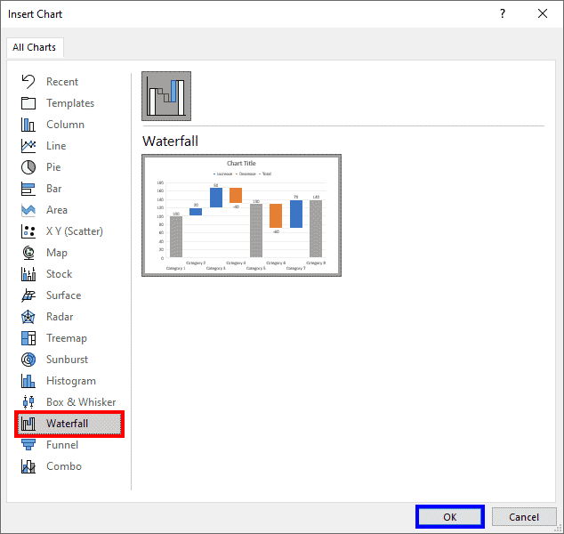
Figure 1: Chart button in PowerPoint- In the ensuing Insert Chart dialog box, select the Waterfall option in the sidebar, as shown highlighted in red within Figure 2, below. Click the OK button, shown highlighted in blue within Figure 2.

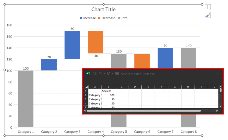
Figure 2: Insert a waterfall chart in PowerPoint- PowerPoint now places a dummy waterfall chart on your slide, as shown in Figure 3, below. Note that PowerPoint also opens an instance of Excel, as shown highlighted in red within Figure 3 that contains the data for this chart.

Figure 3: Dummy waterfall chart
Dummy Data in Charts?
- Dummy charts contain some boilerplate data that PowerPoint helpfully fills in when you create charts. This data can then be replaced with the actual data you want to use. This behavior is different than what you see with the same charts in Excel, where no dummy data is provided.
- To alter the data in the waterfall chart, you will need to update values within the Excel instance. Once the data is updated, you can close this Excel window.
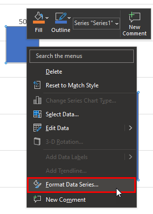
- Add Connectors Between Columns: To add connectors between columns, right-click any of the columns, and choose the Format Data Series option from the contextual menu, as shown highlighted in red within Figure 4, below.

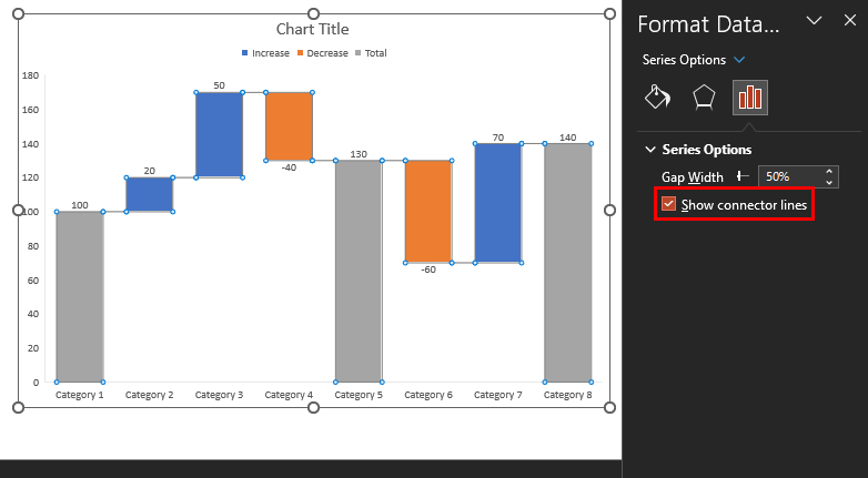
Figure 4: Format Data Series- Doing so opens the Format Data Series task pane. Within this pane, select the Show connector lines checkbox, as shown highlighted in red within Figure 5, below. You will now see connectors on the waterfall chart. Do note that you cannot alter the thickness and color of these connectors without altering the outline color of the columns.

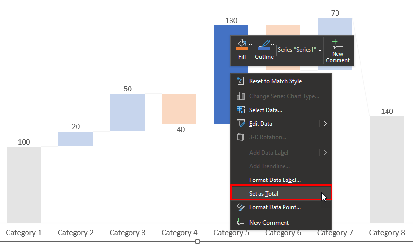
Figure 5: Show connector lines- Set More Total Columns: Also, to set any In-between column as a Total value column, click on the column once to select all columns. Then click again so that only one column is selected (all other columns will gray out). Then, right-click the column and choose the Set as Total option in the resultant contextual menu, as shown highlighted in red within Figure 6, below.

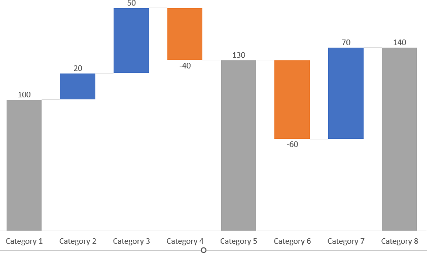
Figure 6: Set as Total in PowerPoint- You can see the result in Figure 7, below. Compare with Figure 6, above.

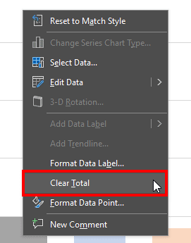
Figure 7: Total column added in PowerPoint- To change a Total value column to an In-between column, similarly, access the contextual menu, and choose the Clear Total option in the resultant contextual menu as shown highlighted in red within Figure 8, below.

Figure 8: Clear Total in PowerPoint- Do note that PowerPoint automatically colors the columns differently, based on whether you input positive or negative values.
- Save your presentation often.
PowerPoint’s waterfall charts are basic and may not provide options for some waterfall chart features. In case you are looking for waterfall charts with more features within PowerPoint, do look at think-cell, an add-in for PowerPoint. Lean more in our Waterfall Charts using think-cell add-in for PowerPoint article.
Back
Limitations of Creating Waterfall Charts in PowerPoint
From the preceding section, you might have realized that there are several limitations within PowerPoint’s implementation of the waterfall chart feature. Here are a few of them:
- PowerPoint makes it very difficult to add total columns and to set them back as normal columns. This process requires too many clicks, and it’s not obvious that you need to click your columns twice to find the relevant option in your right-click menu.
- Adding connectors is again a long-drawn process and you cannot format the connectors separately. All line styling added to connectors such as thickness and color are also forcefully added to the actual chart columns.
- Annotating waterfall charts is not an easy option, with very limited options. You will have to use workarounds to overcome these limitations.
- PowerPoint only lets you create Build-up waterfalls and there’s no option for Build-down waterfalls.
- You cannot sort your columns by showing positive or negative values grouped together.
- All negative values are indicated by a minus sign on the front. You may not want to show the minus sign since the dropping column indicates that this is a negative value. You cannot achieve this result in PowerPoint.
Many of these issues can be resolved by creating waterfall charts in PowerPoint using the think-cell add-in.
Back

