We explored what Gantt charts are, and why you should even use a Gantt chart. We also looked at example scenarios that can benefit from the use of Gantt charts.
Next, we will look at the actual process of creating a Gantt chart.
Should You Create Gantt Charts in PowerPoint?
Create a Gantt Chart in PowerPoint
What About Microsoft Project?
Should You Create Gantt Charts in PowerPoint?
There are many Gantt chart tools available. However, if you want your chart to be used within PowerPoint, then you should look at think-cell, an add-in that enhances PowerPoint’s capabilities of creating Gantt charts and many more chart types and visualizations.
That brings forth a question: do you really need think-cell to create a Gantt chart? Why not create a Gantt chart in PowerPoint itself?
Technically, yes, you can create a bar chart in PowerPoint and go through some hoops and workarounds to make it look like a Gantt chart. However, let’s not celebrate yet, because the result would only be a workaround and not something that’s easy to edit or update.
If that made you curious, let us explore creating a Gantt chart in PowerPoint next. Do note that we are only looking at a proof of concept here, and hopefully, future updates to PowerPoint will make this task easier.
Back
Create a Gantt Chart in PowerPoint
Yes, this is a more involved process with workarounds. If this seems like a lot of work, feel free to skip this part and go to the page on creating a Gantt chart using think-cell.
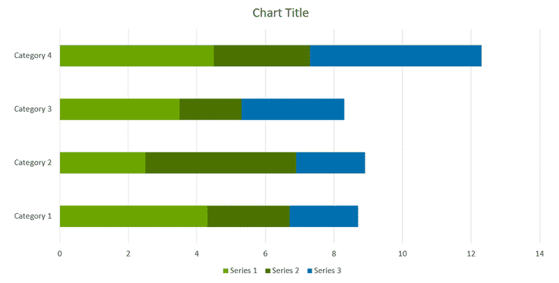
- Within PowerPoint, add a new bar chart, and PowerPoint will add a dummy chart with some data already added, as shown in Figure 1, below. If any Excel sheet with the data shows up, close this Excel window. We will learn how to bring back this Excel sheet in the next step.

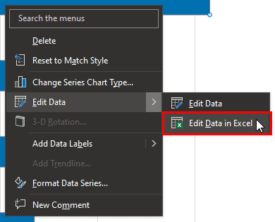
Figure 1: Add a bar chart in PowerPoint- Now, peek at the data used for the chart. Assuming that the Excel sheet with the dummy data is not visible, you can right-click on the chart itself and choose the Edit Data | Edit Data in Excel option, as shown highlighted in red within Figure 2, below.

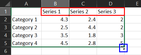
Figure 2: Edit data in Excel- Doing so brings up Excel with your data, as shown in Figure 3, below. Notice that there may be more than two Series in columns named Series 1, Series 2, Series 3, etc. These column headers are highlighted in red within Figure 3.

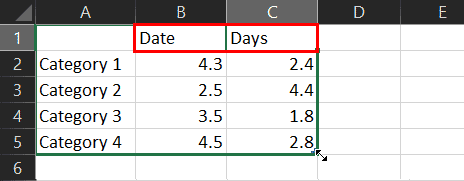
Figure 3: Trim data in Excel- When you take your cursor towards the bottom-right of this data, it will turn into a two-headed arrow, as shown highlighted in blue within Figure 3, above. Now, drag this cursor inwards so that you are left only with two Series columns, as shown in Figure 4, below. Notice that we deleted the content of the extra columns(s) and renamed the column headers to Date and Days, as shown highlighted in red within Figure 4.

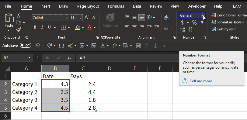
Figure 4: Trimmed to two series in Excel- Next, select all values in the Date column, as shown highlighted in red within Figure 5, below. With these values selected, access the Home tab of the Ribbon and click on the Number Format drop-down, as shown highlighted in blue within Figure 5.

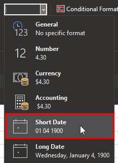
Figure 5: Change the Number Format- Within the Number Format dropdown, select the option named Short Date, as shown highlighted in red within Figure 6, below.

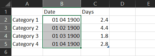
Figure 6: Change format to Short Date- You may now see a bunch of hashes rather than the dates you were expecting. Not to worry, because all you need to do now is drag to make the column wider and you will see the dates, as shown in Figure 7, below. Compare with Figure 5, shown previously on this page.

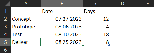
Figure 7: Format changed to dates- Now, replace these dates with your own dates. Next, in the first column, change category names to your task names. You may want to add more than the 4 tasks shown here. Also, add values pertaining to how many days each task will require in the Days column. You can see our edits in Figure 8, below.

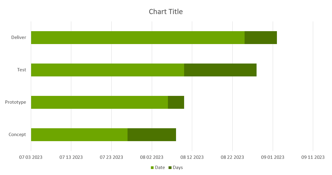
Figure 8: Updated values in Excel- Here is the resultant chart, as shown in Figure 9, below. You’ll notice that it’s very different than the chart we started with in Figure 1, shown previously on this page. Yes, this doesn’t look like a Gantt chart yet.

Figure 9: Almost a Gantt chart- We won’t address all these areas now, but let’s explore these problem areas:
- The default layout of this chart is bottom to top, so that the Concept task is at the bottom of the task list. Also, the time axis in a Gantt chart is typically on the top, and not at the bottom, as shown in Figure 9, above.
- Yes, both these aspects can be changed within PowerPoint.
- Secondly, the first series, Date should not show up as a bar in the chart. You can use a workaround to make the fill transparent, so that even though this bar exists, it’s not visible.
- Although our first date was July 27th, PowerPoint spans this chart axis from July 3rd onwards. You can change this by setting the minimum axis value in PowerPoint.
- Finally, the labels should be on the bars themselves, and not on the axis. Again, this is doable.
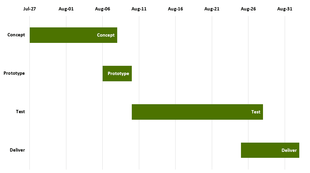
- So, although these defaults don’t happen on their own, there are some workarounds and options that will provide results, as shown in Figure 10, below.

Figure 10: Gantt chart created in PowerPoint
As you can see, this is a good enough result, but it uses a cumbersome process, and edits can become extremely time-consuming.
Back
What About Microsoft Project?
So, what about Microsoft Project? Wouldn’t that be a better option to create Gantt charts? Yes indeed, Microsoft Project as a program is something that almost uses a Gantt chart as its interface.
However, you cannot insert a Project Gantt chart in PowerPoint. To do so, you will have to save your Gantt chart in Project as a picture, and then insert the picture in PowerPoint.
And even if you do so, you will have to go back to Project for any edits, and then resave it as a picture you can replace within PowerPoint. Did we also not say that Project is expensive and cannot create the other chart types that you can create using think-cell?
Back
