empower Charts is a PowerPoint add-in that simplifies the creation of a broad range of chart types, including bar charts, pie charts, and line graphs, while ensuring alignment with brand guidelines. In addition to standard charting capabilities, the tool supports project management visualizations such as Gantt charts. This feature allows users to build timeline-based graphics directly within PowerPoint, offering a practical alternative to external applications or manual formatting.
You May Also Like: empower Express: The Indezine Review
In this tutorial, we will explore the entire process of creating a Gantt chart from scratch using the empower Charts add-in within PowerPoint.
Getting empower
Using empower
Adjust Timeline
Add and Rename Tasks
Add Gantt Bars
Add Milestones
Add Highlights and Datelines
More Options
Conclusion
Follow these steps to create a new Gantt chart using the empower add-in:
Getting empower
- First, confirm that the empower add-in for PowerPoint is installed on your system. Do you know that a free 30-day trial version can be downloaded from the empower website? Once empower is installed, open PowerPoint, and you will see the new empower tab of the Ribbon, shown highlighted in red within Figure 1, below.

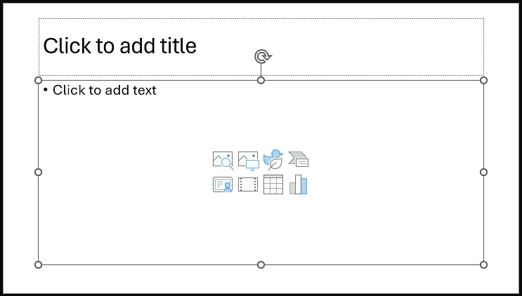
Figure 1: empower tab of the Ribbon- Now, add a new slide and change its layout to Title and Content, so that you end up with a slide similar to the one shown in Figure 2, below. Click to select the Content placeholder.

Figure 2: New slide with Title and Content layout- Back
Using empower
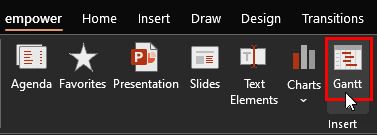
- Now, access the empower tab of the Ribbon, and click the Gantt button, as shown highlighted in red within Figure 3, below.

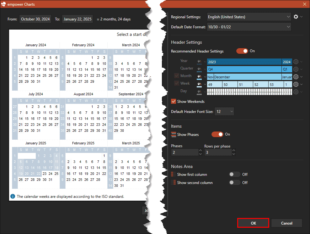
Figure 3: Click the Gantt button- Doing so brings up the empower Charts dialog box, as shown in Figure 4, below. We won’t change any settings now, so you can click the OK button, highlighted in red within Figure 4.

Figure 4: Gantt chart dialog box in empower- You will now see a new Gantt chart added to your slide placeholder, as shown in Figure 5, below.

Figure 5: Blank Gantt chart- Back
Adjust Timeline
- Do note that this is an entirely blank chart with no sample data. You need to input everything on your own. Let us start with adjusting the timeline for this chart. To do so, click on the timeline at the top. Doing so brings up a floating toolbar, shown in Figure 6, below. Click on the extreme left on this toolbar on the area that shows the span of dates in the timeline.

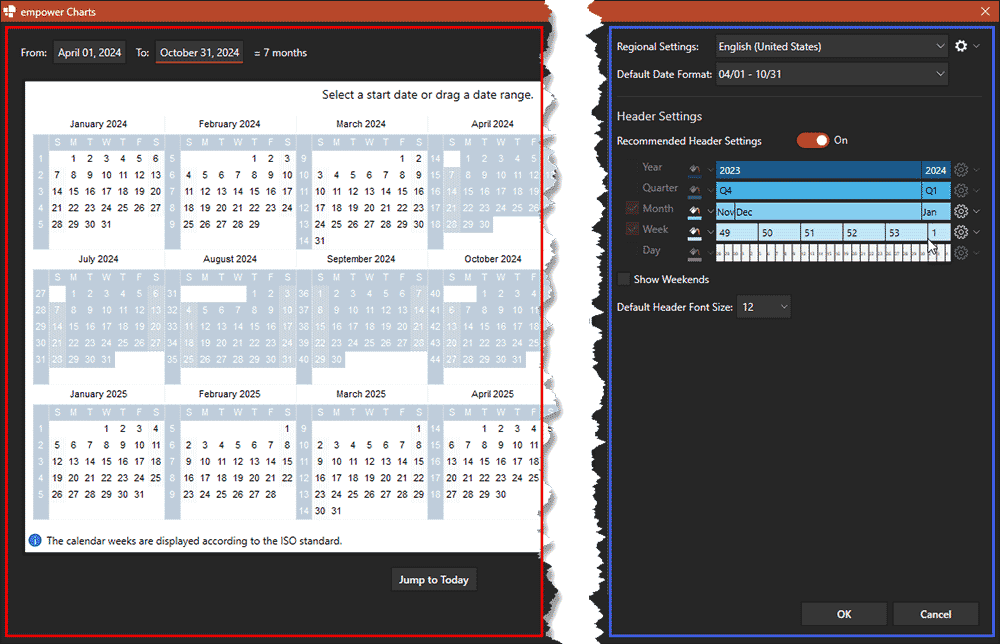
Figure 6: Date span in timeline- Doing so brings up the empower Charts’ Date dialog box, as shown in Figure 7, below. Yes, this box looks like there are many options, but when you start using it, you’ll find that these options are simple. The large area on the left, highlighted in red within Figure 7, is the calendar, which shows the duration of the timeline. The area on the right, highlighted in blue within Figure 7, lets you choose from other options, such as regional settings, date format, and header settings.

Figure 7: empower Charts’ Date dialog box- When you are done, click the OK button to make these changes and get back to your slide.
- Back
Add and Rename Tasks
- empower adds two Phases with three Rows each, as shown in Figure 5, previously on this page. The Rows represent individual tasks, and a Phase is a collection of related tasks. You can easily add more Phases and Rows.
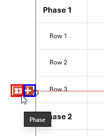
- To add a new Phase, click on a cell within the first column that’s above any Phase, and you will see two plus icons, as shown in Figure 8, below. The smaller plus icon, highlighted in red add a Phase, and the larger plus icon, highlighted in blue adds a Row.

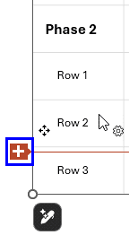
Figure 8: Add a Phase or a Row in empower- To add a new Row, click on any cell within the first column. You may see two plus icons, as shown in Figure 8, above, or you may see one plus icon, as shown highlighted in blue within Figure 9, below. Either way, click the icons highlighted in blue to add a new Row.

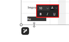
Figure 9: Add a Row in empower- Now is a good time to rename your Phase and Row labels from the default Phase 2 or Row 3. To do so, click on the name and type to overwrite the existing name, as shown in Figure 10, below. Notice that you will also see the Mini Toolbar that lets you change font attributes.

Figure 10: Rename Phases and Rows- Back
Add Gantt Bars
- Now is the time to add Gantt bars. This is easily accomplished by clicking and dragging within the Task rows, as shown in Figure 11, below. Drag and draw as needed. Even if you do not drag accurately, that’s OK because you can always edit the starting and ending points of the Gantt bars easily enough.

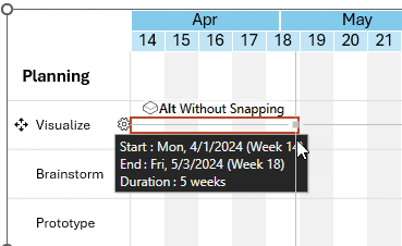
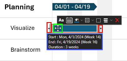
Figure 11: Drag a Gantt bar- To edit, select the Gantt bar, as shown in Figure 12, below. When selected, a tooltip appears displaying the Start and End values, highlighted in blue within Figure 12.

Figure 12: Edit the Gantt bar- To modify the timeline, drag the Start or End adjustment handles, also highlighted in red within Figure 12, above, to the desired positions. You can also entirely move the Gantt chart by dragging it to another location. To do so, you will have to place your cursor over the Gantt bar, so that you can see the four-arrowed cursor, as shown highlighted in green. Then move as needed.
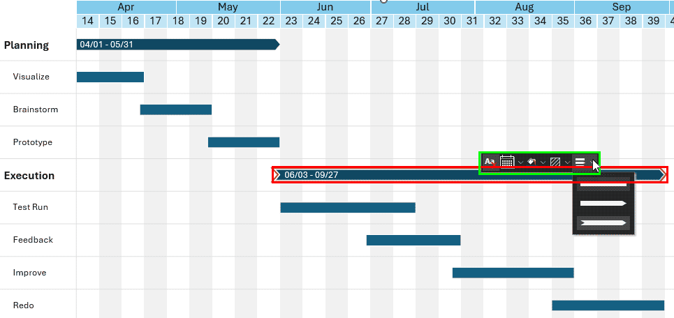
- Similarly, add more Gantt bars, as shown in Figure 13, below.

Figure 13: Master Gantt bar- You will notice that the Phase column is automatically populated with a master Gantt bar, as shown highlighted in red within Figure 13, above. This cannot be individually shortened, lengthened, or moved, but you can change the color and style from the Mini Toolbar, shown highlighted in green within Figure 13.
- Back
Add Milestones
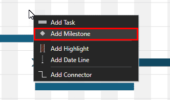
- Next, we will add a Milestone. A Milestone refers to a specific point in a Gantt chart that represents a key event, deadline, or delivery checkpoint within a project timeline. Unlike standard tasks or activities (which span a duration), a milestone has zero duration and is visually represented as a distinct marker—often a diamond shape—positioned at a particular date on the timeline. To add a new Milestone, right-click in the location where you want to add a Milestone. In the ensuing contextual menu, click the Add Milestone option, as shown highlighted in red within Figure 14, below.

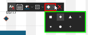
Figure 14: Add Milestone- You can see the Milestone has been added, as shown in Figure 15, below. The Mini Toolbar that spawns let you make formatting changes. By default, the Milestone is a diamond shape, but you can click the Shape button, highlighted in red within Figure 15, to bring up a drop-down gallery of Milestone shapes, shown highlighted in green. Choose another shape as needed.

Figure 15: Change the Milestone shape- Back
Add Highlights and Datelines
- empower Charts lets you add highlighted areas or a dateline. Both these options draw attention to something important within your Gantt chart. To bring up these options, you can right-click in the location where you any of these inserted. You can see the ensuing contextual menu, as shown in Figure 14, previously on this page.
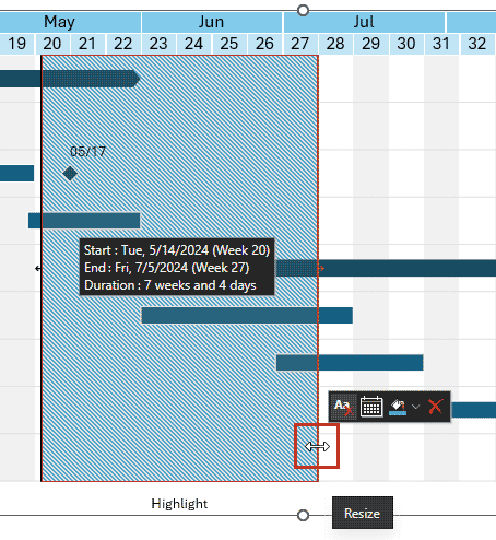
- Click the Add Highlight option to place a highlight within your Gantt chart, as shown in Figure 16, below. By default, a larger highlight is placed but you can resize the highlight by dragging the resize cursor, highlighted in red within Figure 16.

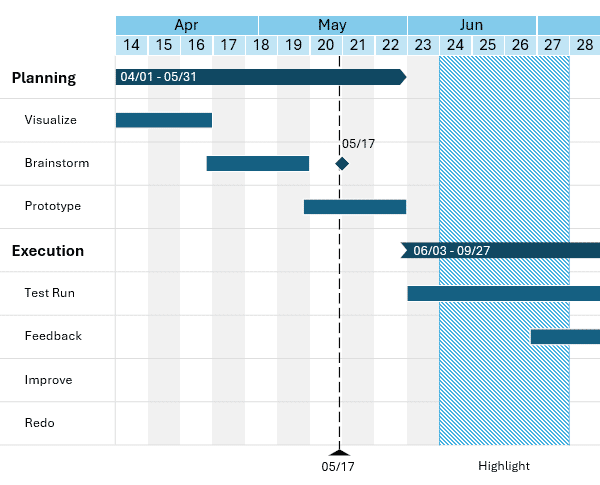
Figure 16: Resize the highlight- You can also choose the Add Date Line option in the menu, as shown in Figure 14, previously on this page. Doing so will add the date line, as shown in Figure 17, below. In our case, we inserted the date line at the same position as the Milestone.

Figure 17: Add Date Line- Back
More Options
- You can also add connectors that add linkages and dependencies between Gantt bars. empower Charts does much more, but we’ll stop here and encourage you to play further. You can buy an empower license, or even get a 30-day trial option.
- Back
Conclusion
Of course, empower does much more than Gantt charts. You can also use other options, and learn more about Gantt Charts in general.
A well-crafted Gantt chart can transform a complex project into a clear, actionable roadmap, and empower Charts makes that process remarkably accessible. By combining intuitive controls with native PowerPoint integration, it allows you to build timelines, tasks, milestones, and highlights with precision and flexibility. Whether you’re presenting to stakeholders or organizing internal workflows, these visual tools help communicate progress and priorities with confidence. While empower may not replace full project management software, it excels at creating polished, presentation-ready visuals quickly. Exploring its additional features, and experimenting with your own layouts will help you get even more value from this versatile add-in.
Back

