Learn about chart elements in PowerPoint 2003 and 2002 for Windows. These chart elements include Series, Categories, Axes, Plot area, Legend, Chart Title, and many more.
Author: Geetesh Bajaj
Product/Version: PowerPoint 2003 and 2002 for Windows
OS: Microsoft Windows XP and higher
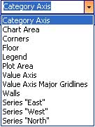
A chart in PowerPoint comprises several, individual objects that we like to call chart elements. On this page, we will explore each individual chart element. Before we do so, we'll show you how you can select these elements individually.
It is important to be able to select these chart elements individually because you can only change the look of an element after you select it. For example, in a column chart you select a column series to change the fill of a column.
For the rest of this page, we are assuming you already have a chart inserted on a PowerPoint slide. If not, check out this page that shows how you can place a new chart on a slide in PowerPoint 2003.
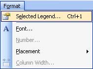
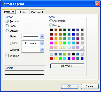
It helps if you know the terminology or the names of individual chart elements. However, even if you are not too chart-aware, PowerPoint lets you select individual chart elements. Follow these steps to learn more:


Although different charts have differing chart elements, these are the common chart elements found in almost all chart types:
Most of the charts have two axes:
Some charts may also have a Z axis.
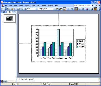
The area within the axes is known as the plot area. The plot area includes the series, gridlines, etc.
There are two types of titles:
This sheet contains the values based on which the chart is created. Although most of the time, the datasheet is only visible in chart editing mode, it can also be made part of the actual chart and thus be visible in slideshow mode.
Every row of data within the datasheet shows up as a component of the chart. These represent the series. Series look different depending upon the chart type. For example, in a column chart, the series are represented as columns, and in pie charts, the series is represented as slices of a pie.
A set of series can be represented as a category. As you can see in Figure 1 above, the components: 1st Quarter, 2nd Quarter, etc. are categories.
These are the individual figures that identify each series. The font and placement for these can be formatted.
This is a box placed normally outside the plot area which provides captions (and/or color coding) to the series, and helps identifying the series. Legends are automatically created with the chart itself, although you can opt to remove the legend.
These are lines representing average values placed at regular intervals on the plot area.
See Also:
Chart Basics: Chart Elements (Glossary Page)
Chart Elements in PowerPoint 2013 for Windows
Chart Elements in PowerPoint 2011 for Mac
Chart Elements in PowerPoint 2010 for Windows
Chart Elements in PowerPoint 2007 for Windows
You May Also Like: How to Overcome the Biggest Potential Blockers of Achievement | Military and Defence PowerPoint Templates


Microsoft and the Office logo are trademarks or registered trademarks of Microsoft Corporation in the United States and/or other countries.