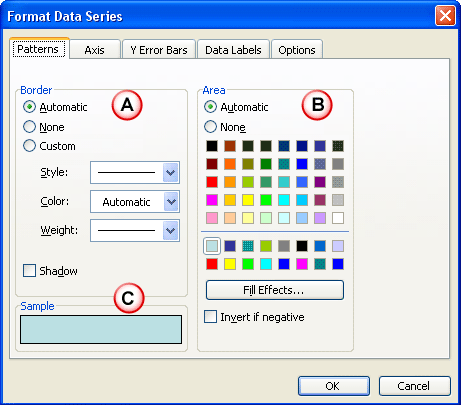
Learn to change fills and borders of the chart Data Series in PowerPoint 2003 and 2002 for Windows. By default, Theme Accent colors are used but you can change to another color or also a pattern, texture, or a picture fill.
Author: Geetesh Bajaj
Product/Version: PowerPoint 2003 and 2002 for Windows
OS: Microsoft Windows XP and higher
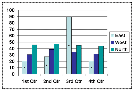
PowerPoint provides several chart types to choose from, and even allows the user to customize the look of any chart by changing the fills and outlines. Before starting you need to have a chart in your presentation. You can learn how to insert a chart in PowerPoint 2002 - 2003 for Windows and thereafter, change the Chart Type. In this tutorial, you'll learn how you can change the fills and outlines of a Data Series within a chart. Follow these steps to learn more:


See Also:
Chart Basics: Changing Fill and Border of Charts (Glossary Page)
Changing Fill and Border of Charts in PowerPoint 2013 for Windows
Changing Fill and Border of Charts in PowerPoint 2011 for Mac
Changing Fill and Border of Charts in PowerPoint 2010 for Windows
Changing Fill and Border of Charts in PowerPoint 2007 for Windows
You May Also Like: Obama Gets Back on Message | Rectangles PowerPoint Templates


Microsoft and the Office logo are trademarks or registered trademarks of Microsoft Corporation in the United States and/or other countries.