Read an exclusive book excerpt from Special Edition Using Microsoft Office PowerPoint 2003.
Author: Patrice-Anne Rutledge and Jim Grey
Product/Version: PowerPoint
 This book extract from Special Edition Using Microsoft Office PowerPoint 2003 is an Indezine exclusive with permission from Pearson Education.
The book itself is probably the most detailed volume on PowerPoint you'll find anywhere. In addition, it also looks beyond PowerPoint to design sense, presentation and speaking skills. The book has been completely updated for PowerPoint 2003 and includes a free CD that contains software that you can use.
I wish to thank Patrice-Anne Rutledge and Amy Sorokas for facilitating the permission to extract.
Exploring Chart Possibilities
Understanding Charts in PowerPoint
Adding a Chart
PowerPoint charts can be as simple or as complex as you like. You can create a basic chart right inside PowerPoint using Microsoft Graph, or you can create a full-featured chart using Microsoft Excel and insert it into your presentation. You can choose from common chart types such as column, bar, line, and pie charts; try something out of the ordinary such as a doughnut or radar chart; or create a chart type of your own. PowerPoint charts are preformatted based on the attached design template, but you can also change nearly every aspect of a chart—its color, text, labels, and more.
A chart, also referred to as a graph, can be a useful tool for communicating numeric information in a concise format. You could create a chart illustrating sales revenue per region or the percentage of sales allocated to each of your products, for example. As you begin to work with charts, you'll discover a multitude of uses for them.
You can use Microsoft Graph to create charts in your presentation, or you can insert charts created in another application, such as Excel. Using Microsoft Graph inside PowerPoint is the easiest way to create a graph, but doesn't offer any calculation or formula capabilities for your chart data. If you've already created a chart in Excel or you need to analyze complex data, it's best to insert an Excel chart.
Before you start creating a chart using Microsoft Graph from within PowerPoint, you should become familiar with chart terminology. Table 11.1 lists these terms and their definitions.
Table 11.1 Chart Object Terminology
| Term | Definition |
|---|---|
| Axis | A line that frames one side of the plot area. The two most common axes are the value axis and the category axis. |
| Datasheet | A grid that resembles a spreadsheet, in which you can enter data for your chart. |
| Data label | Text that describes a specific data marker or series of data markers. This can be a numeric value, text, a percent, or a combination of these items. |
| Data marker | A value that represents a single cell or data point in a datasheet. |
| Data series | The main categories of information in a chart—usually reflected in a chart's legend and in the first cell of each datasheet row or column. |
| Data table | A grid in the chart that lists the exact data in the datasheet. |
| Gridlines | Lines that display across the category or value axes to make a chart easier to read. By default, major gridlines are in increments of 10 and minor gridlines in increments of 2. |
| Legend | A box that lists and color-codes all data series. |
| Trendline | A line that forecasts future values based on current data. |
Figure 11.1 shows some of these chart objects.
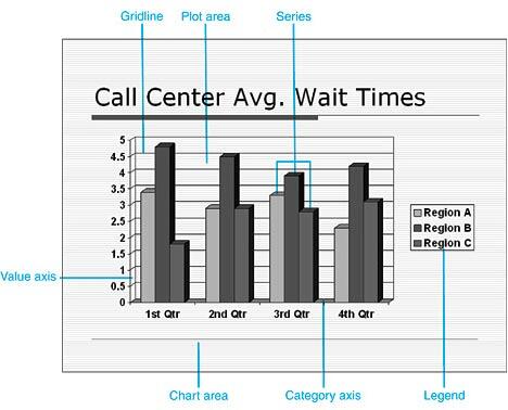
Figure 11.1: Learn the basic objects of a chart before you create one.
The fastest way to add a chart to your presentation is to add a slide and apply a layout that contains a chart. To do so, click the New Slide button on the Formatting toolbar and then choose a layout from the Slide Layout task pane. The next step varies depending on the slide layout you choose.
If you choose any of the layouts in the Content Layouts or Text and Content Layouts sections, you need to click the Insert Chart button on the content palette that displays (see Figure 11.2) to activate the chart and Microsoft Graph.
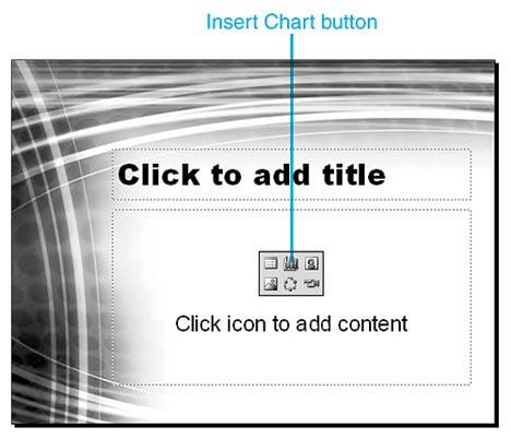
Figure 11.2:
Click the Insert Chart button to start creating a chart.
If you choose one of the layouts containing a chart in the Other Layouts section, you need to double-click the chart placeholder to activate the chart and Microsoft Graph. Figure 11.3 shows a sample chart slide with a chart placeholder.
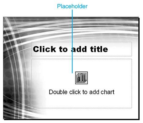
Figure 11.3:
You can start adding a chart by double-clicking the placeholder.
Tip: If you want to create a slide with a single chart and no other content, choose the Title and Chart slide layout.
To learn more about how slide layouts affect your presentation, see "Understanding Slide Layouts" in Chapter 2, "Creating a Basic Presentation," p. 43.
You can also insert a chart into an existing slide by clicking the Insert Chart button on the Standard toolbar or by selecting Insert, Chart.
Figure 11.4 shows what you see after you click the Insert Chart button on a content palette or double-click a chart placeholder. A sample 3D clustered column chart appears, and the related datasheet opens. The menu bar and toolbars are also customized for Microsoft Graph. The menu bar now includes Data and Chart menu items, and the Standard toolbar includes several new options, explained in Table 11.2.
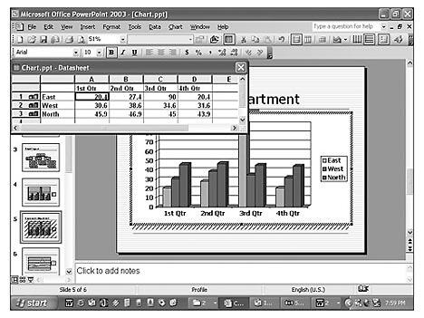
Figure 11.4:
PowerPoint displays a chart with sample data.
Table 11.2 Standard Toolbar Chart Options
| Button | Name | Description |
|---|---|---|
| Chart Objects | Lets you select a chart object such as a plot area, a chart area, a legend, an axis, or a series. | |
| Format | Opens a Format dialog box tailored to the selected chart object. | |
| Import File | Opens the Import File dialog box from which you can import chart data from another file, such as an Excel worksheet, into your chart. | |
| View Datasheet | Displays the chart's datasheet. | |
| By Row | Displays datasheet row data as the data series (the default). | |
| By Column | Displays datasheet column data as the data series. | |
| Data Table | Displays a table with all the datasheet data in your chart. | |
| Chart Type | Lets you apply a new chart type from a palette that appears. | |
| Category Axis Gridlines | Displays category axis gridlines. | |
| Value Axis Gridlines | Displays value axis gridlines. | |
| Legend | Displays a legend on your chart. | |
| Drawing | Displays the Drawing toolbar. | |
| Fill Color | Lets you apply fill color and fill effects to selected objects. |
If you don't see these menu and toolbar options, Microsoft Graph isn't active. To activate it, double-click the chart in PowerPoint and you'll then be able to view the Data and Chart menus and chart toolbar options.
To determine what each object is in a chart you've created, place the mouse on that object or part of the chart and a chart tip displays its name. Figure 11.5 shows an example of a chart tip with the name and numeric value for a data series.
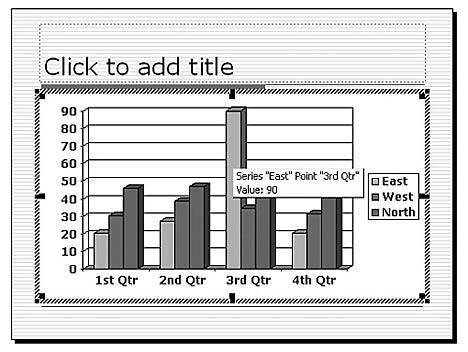
Figure 11.5: This chart tip lets you know the name of the chart object as well as its value.
If the chart tip doesn't display, activate Microsoft Graph by double-clicking the chart, choose Tools, Options, and then verify that the Show Names and Show Values check boxes are selected on the Chart tab of the Graph Options dialog box (see Figure 11.6).
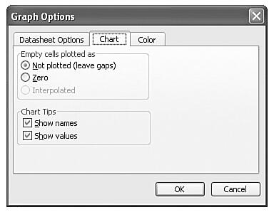
Figure 11.6: PowerPoint displays names and values in chart tips by default.
Modifying Your Chart
You can quickly create a basic chart, and you can make numerous enhancements and formatting changes. After you activate Microsoft Graph to create a chart, it's easiest to proceed in this order:
See Also:
Working with Charts - 4 of 4
Working with Charts - 3 of 4
Working with Charts - 2 of 4
You May Also Like: Obama Gets Back on Message | Azerbaijan Flags and Maps PowerPoint Templates

Microsoft and the Office logo are trademarks or registered trademarks of Microsoft Corporation in the United States and/or other countries.