Learn to vary the fill color of a series in a chart in PowerPoint 2011 for Mac. This is very important when you have just one series with multiple categories in your chart.
Author: Geetesh Bajaj
Product/Version: PowerPoint 2011 for Mac
OS: Mac OS X
If your chart includes only one series and several categories, then by default individual chart segments will use the same fill color (such as individual columns in a column chart) or varying colors (such as segments in a pie chart), depending upon the chart type you are working with. For all charts, you can always change the color of the entire series but that works best if you have multiple series in your chart, as shown in Figure 1, below. The same is not true for a chart that has only one series. In that case displaying all individual elements of a chart series in the same color can make your chart look dull as with the chart shown in Figure 2, later on this page. This similar colorization also does not provide a proper way for your audience to compare the individual series' elements.
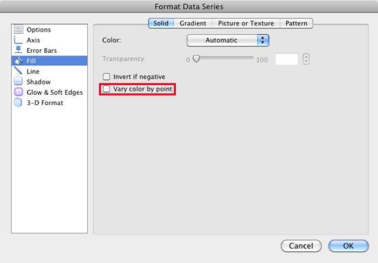
PowerPoint 2011 for Mac lets you resolve this limitation by using the Vary color by point option. This option uses different colors for individual series' elements. Before you proceed further, there are certain characteristics of the Vary color by point option that you should be aware of:
When you insert a new chart in PowerPoint 2011, it may look like the one you see in Figure 1, below. As you can see, this is a column chart in which there is a set of 3 series in each of the 4 categories. The color of these 3 series represent the 1st, 2nd, and 3rd accent colors in the active Theme respectively, from left to right.
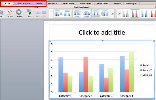
Figure 1: Chart in PowerPoint
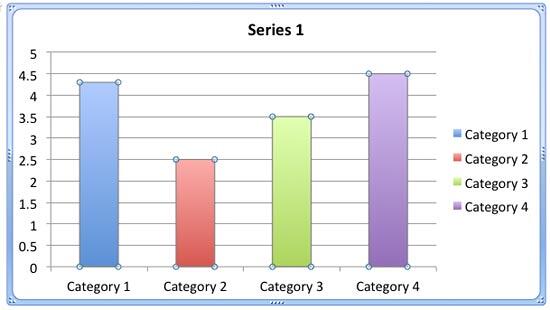
The Vary color by point option works for a chart with a single series, and two or more categories, as shown in Figure 2, below.
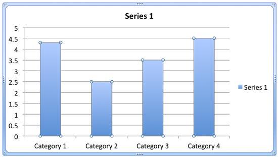
Figure 2: One series and four categories
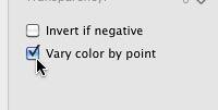
Now, follow these steps to learn how to change the color of category elements in a chart with just a single series and multiple categories:

See Also:
Advanced Chart Techniques: Vary Colors by Point Option for Charts (Glossary Page)
Vary Colors by Point Option for Charts in PowerPoint 2013 for Windows
Vary Colors by Point Option for Charts in PowerPoint 2010 for Windows
You May Also Like: The Art of Storytelling: Presentations Are Corporate Storytelling | Raisins PowerPoint Templates


Microsoft and the Office logo are trademarks or registered trademarks of Microsoft Corporation in the United States and/or other countries.