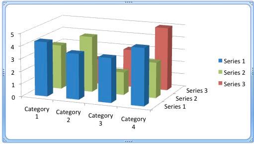
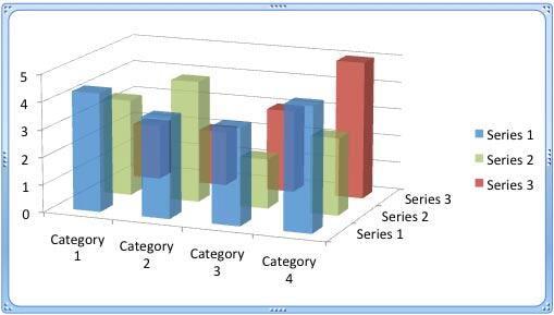
OK, you read the title right! We reiterate that you should still not use 3D charts unless you must have a Z-axis. Having said that, we are talking about making your 3D columns in a chart transparent. Yes, there's a reason to do so especially when you find that some of the columns in your 3D chart may be hiding behind one or more of the other columns, just because they are not tall enough. Look at the chart shown in Figure 1, below. Notice that one of the red columns is completely hidden. Agreed, that column does not represent superlative performance but it still needs to be visible.

Figure 1: One of the Series 3 columns is completely hidden
Continuing our observation of Figure 1, we need to find a way to make the completely hidden red column visible! One easy solution for this problem is to reduce the opacity of the columns in the front. Follow these steps to learn more:
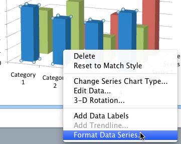
- Start by selecting one of the series in the front. We selected the series represented by the blue columns. Thereafter, right-click (or Ctrl+click) to bring up the contextual menu, you see in Figure 2, below. Choose the Format Data Series option.

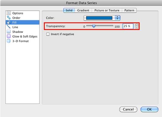
Figure 2: Format Data Series option selected - Doing so brings up the Format Data Series dialog box that you see in Figure 3, below. Make sure that the Fill option is selected within the sidebar. Then, select a tab depending upon the type of the fill used for the selected series. In Figure 3, you can see that we have selected the Solid tab.

Figure 3: Format Data Series dialog box displaying greyed out Transparency slider - As you can see in Figure 3 above, the Transparency slider (highlighted in red) is grayed out! This is because the fill color is set to Automatic, as shown highlighted in blue within Figure 3, above. To change the fill transparency, you need to change the fill type from Automatic to one of the Accent colors. In Figure 4 you can see that we are changing the data series fill to a solid color.

Figure 4: Solid color fill being selected for the series - We set the transparency to 25%, as shown highlighted in red within Figure 5, below.

Figure 5: Data series transparency set to 25% Transparency for Columns without Solid Fills?
- We cover transparency for solid fills in this tutorial. However if your 3D column is filled with a gradient, a picture, or some other shape fill, you can still change the transparency for that fill type. Refer to our Transparency for Shape Fills in PowerPoint 2011 for Mac tutorial. Even though that tutorial is about shape fills, the same techniques work for data series fills within charts.
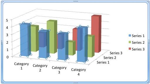
- Doing so makes the selected series semi-transparent as shown in Figure 6, below.

Figure 6: Columns of series 1 made semi-transparent - Similarly, you can change the transparency of columns representing other series. In Figure 7, below you can see that we have changed the transparency of Series 1 and 2 so that columns behind them are also visible.

Figure 7: Reducing the fill opacity of columns has made hidden chart elements visible - Compare charts in Figures 7 and 1. You can see that in Figure 7, the columns of Series 3 which were hidden earlier, are visible.
- Save your presentation often.
