In PowerPoint, the entire chart data that shows up in the form of series and categories is actually stored within an Excel sheet. These series and categories may show up on your chart in different ways depending upon the chart type. Almost any chart type, even if it is not a column chart, compares one set of values with another. Once you delete any of these values, they no longer show on your chart—so, the level of comparison reduces. However deleting is not always the best option, especially if you want to retrieve those values later whenever required. The solution is to temporarily hide values you no longer need, and then unhide them as and when you want to expose those values.
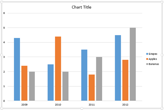
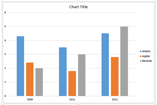
Look at the chart shown in Figure 1, below. We will use this chart as a sample chart to show you how its appearance changes after hiding a given series or category.

Figure 1: A sample chart
Before you proceed further, make sure you bring up the Excel sheet that contains the data related to your PowerPoint chart. Learn more about this process in our Edit Chart Data in PowerPoint 2013 for Windows tutorial. Thereafter, follow the steps explained in the subsequent two sections to hide or unhide your data in PowerPoint 2013 for Windows:
Hide/Unhide a Series
Follow these steps to hide/unhide a series in your chart:
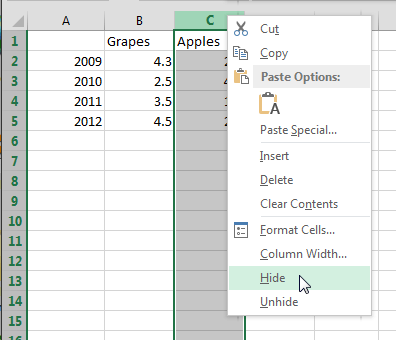
- Look at Figure 2, below. We want to hide the entire 'Apples' series. To do so, you will need to click the Column Header to select the entire column (series) to be hidden. Then right-click the Column Header. From the resultant contextual menu, select the Hide option as shown in Figure 2.

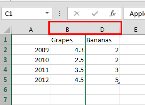
Figure 2: Select the Hide option - This step will hide the selected series (Apples), as shown in Figure 3. Notice that the column C, representing Apples no longer shows in between columns B and D, as highlighted in red within Figure 3.

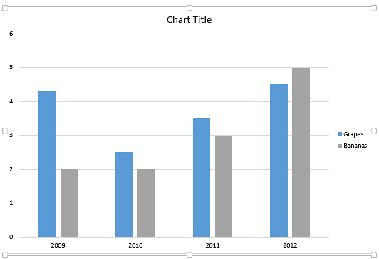
Figure 3: Series hidden within the Excel sheet - While keeping your Excel sheet open, navigate to your PowerPoint slide. You'll see that the hidden 'Apples' series is no longer showing in the chart too, as shown in Figure 4 (compare with the chart in Figure 1, earlier on this page).

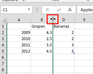
Figure 4: Chart reflecting the result of hiding the Series - To restore the hidden series, first hover your cursor over the position of the hidden series in the Column Header so that the cursor changes to a double arrowed icon as shown in Figure 5 (highlighted in red). Alternatively, select the Column Headers of the columns before and after the hidden column. In this case, you would select Column Headers B and D.

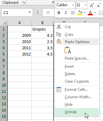
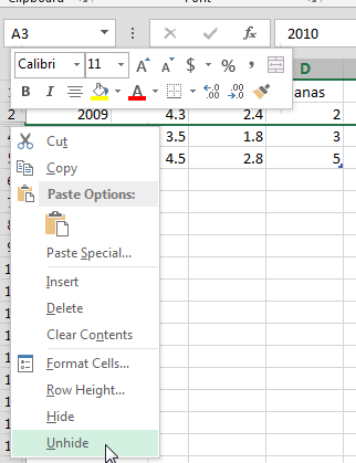
Figure 5: Cursor changed to point the hidden Series - Now, right-click to bring up the contextual menu shown in Figure 6. In this contextual menu, select the Unhide option.

Figure 6: Select the Unhide option to reveal the hidden Series - This step will display the hidden series in the Excel data as well as in the Chart on your PowerPoint slide.
Hide/Unhide a Category
Follow these steps to hide/unhide a category in your chart:
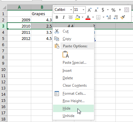
- Look at Figure 7, below. We want to hide the category representing the year 2010. To do so, you will need to click the Row Header to select the entire row (category) that we want to hide. Then right-click the Row Header. From the resultant contextual menu, select the Hide option as shown in Figure 7.

Figure 7: Select the Hide option to hide the Category - This action will hide the selected category (2010) as shown in Figure 8. Notice that the 3rd row representing the year 2010 is no longer showing between 2nd and 4th rows, as highlighted in red within Figure 8.

Figure 8: Category hidden within the Excel data - While keeping your Excel sheet open, navigate to your PowerPoint slide. You'll see that the hidden category is no longer showing in the chart, as shown in Figure 9, below (compare with the chart in Figure 1, earlier on this page).

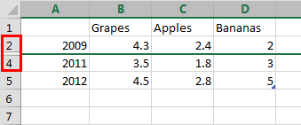
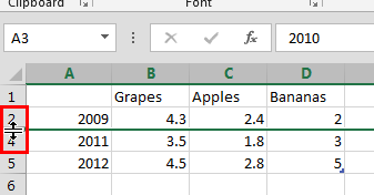
Figure 9: Chart reflecting the result of hiding the Category - To restore the hidden category, first hover your cursor over the position of the hidden category in the Row Header so that the cursor changes to a double arrowed icon as shown in Figure 10 (highlighted in red). Alternatively, select both the Row Headers for the rows above and below the hidden row. In this case, you would select Row Headers 2 and 4.

Figure 10: Cursor changed to point the hidden Category - Then, right-click to bring up the contextual menu shown in Figure 11. In this contextual menu, select the Unhide option.

Figure 11: Select the Unhide option to reveal the hidden Category - This step will unhide the hidden category in the Excel data as well as in the Chart on your PowerPoint slide.
When you are done with hiding/showing the series or categories within your Excel sheet, go ahead and close Excel. The changes will automatically reflect within the chart on your PowerPoint slide.
More about Hiding Series and Categories
Sometimes when you are trying to hide a series or a category, you may find that even though you have hidden them within the Excel sheet, they are still visible in the chart! To learn how to solve this issue, follow these steps:
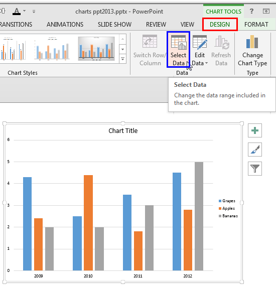
- Select the Chart Tools Design contextual tab of the Ribbon (highlighted in red within Figure 12). Then click the Select Data button (highlighted in blue within Figure 12).

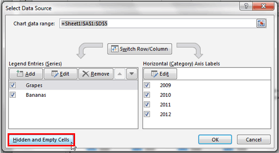
Figure 12: Select Data button - Doing so opens the Excel sheet containing the chart data along with the Select Data Source dialog box that you can see in Figure 13. Here, click the Hidden and Empty Cells button (highlighted in red within Figure 13).

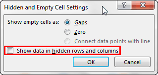
Figure 13: Select Data Source dialog box - This action opens the Hidden and Empty Cell Settings dialog box as shown in Figure 14. Make sure that the Show data in hidden rows and columns check-box is deselected, as shown in Figure 14 (highlighted in red). Then, click the OK button.

Figure 14: Hidden and Empty Cell Settings dialog box - This step will result in hiding those series or category from the chart, that are hidden in the Excel chart data.
