Learn to create distance cartograms in PowerPoint. We use shapes, alignment features, and the Merge Shape tools.
Author: Geetesh Bajaj
Product/Version: PowerPoint
OS: Microsoft Windows and Mac OS X
Before we dive into the world of distance cartograms (don’t worry, we’ll get there!), let’s start with the basics. Imagine if a map and a chart had a baby—that adorable offspring would be called a cartogram. It’s part geography, part data visualization, and all about making complex info easier to understand.
Instead of showing places just as they are, cartograms stretch, shrink, or reshape areas based on data. Think of it like a balloon animal version of a map—still recognizable, but twisted to tell a story.
Cartograms have been around since the mid-1800s—that’s older than the telephone! Back then, clever thinkers were already bending maps to show things like population, trade, or travel time.
So, if regular maps are like GPS directions, cartograms are more like infographics with a sense of direction.
So, if regular maps are like GPS directions, cartograms are more like infographics with a sense of direction.
Nowadays, popular cartograms are of two types:
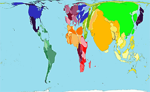
Imagine if countries went to the gym—not to build muscle, but to bulk up based on their population. That’s exactly what area cartograms do! Instead of showing countries by their actual land size, these maps pump them up (or shrink them down) based on other data—like how many people live there.
In a population-based cartogram, geographic boundaries are redefined by data weight rather than landmass. Densely populated nations like India and China expand dramatically, reflecting their demographic significance. Meanwhile, geographically large but sparsely populated countries—such as Canada or Australia—contract visually, underscoring their lighter data footprint.
It’s like giving your map a makeover—less about geography, more about storytelling through stats. Figure 1, below, shows this transformation in action. Who knew maps could be so dramatic?
Source: Global Geographic Topic - Population Patterns - Patterns
Figure 1: Area Cartogram
If regular maps are like road trips with GPS, distance cartograms are more like doodling with purpose. They don’t follow the usual rules of geography—instead, they use concentric circles (think bullseyes or onion layers!) to show how far things are, or how much time or money it takes to get there.
So, forget longitude and latitude—this is more about “how long will it take me to reach the donut shop from here?” than “where exactly is it on the globe?”
Now, creating fancy Area Cartograms in PowerPoint? That’s like trying to bake a cake in a toaster—not what the tool was built for. But here’s the good news: Distance Cartograms are totally doable using PowerPoint’s built-in Shapes and the magical Merge Shape commands. No cartography degree required—just a little creativity and some circle-clicking fun!
Want some ready to use Distance Cartogram samples? Try our Distance Cartogram PowerPoint templates kit.
Follow these steps to create a Distance Cartogram in PowerPoint:
Think of the Blank slide as a digital sketchpad with no lines and no labels—just room to swirl those spirals without bumping into a text box begging for a title. The idea of a “blank canvas” dates back centuries to artists priming their boards before painting. Even Picasso had to start with a bare surface—so you’re in good company.
Sure, that Blank layout in PowerPoint is like the rebel of the slide family—no title, no placeholders, just a wide-open dance floor. But here's a little secret: even when you don't want a title box cramping your design, it's still smart to include a title behind the scenes. Yes, there is merit in all slides having a title, especially for accessibility reasons, even if it is not visible on the slide itself. To know more, read our Hiding Slide Titles in PowerPoint tutorial.

A circle is an oval that has identical width and height attributes. Learn how to draw a perfect circle in PowerPoint
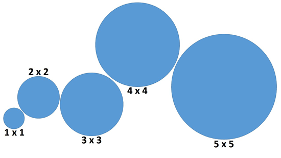
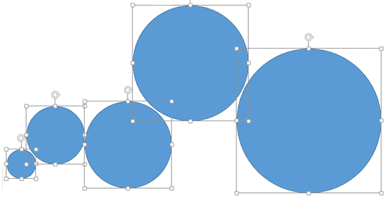
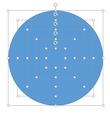
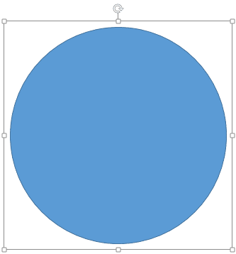
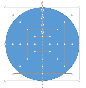
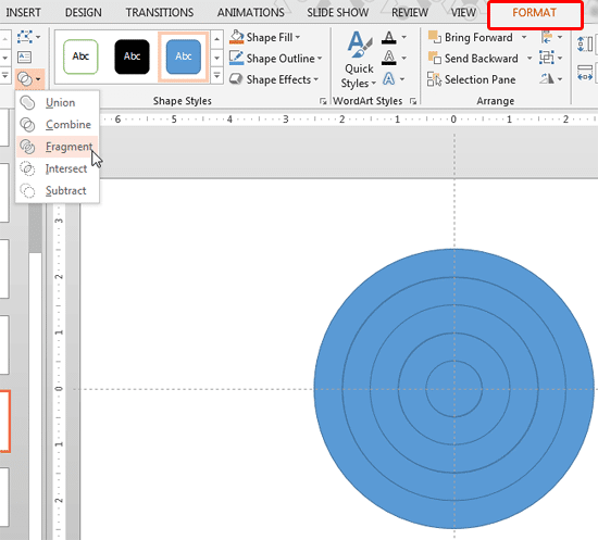
The Fragment option within Merge Shapes is only available in PowerPoint 2013 for Windows and higher versions.

At this point, you know how to create a basic distance cartogram. Next, let us explore how you can use the created structure of cartograms in our Advanced Distance Cartograms in PowerPoint tutorial.
Yes, they’re great for visualizing reach, delivery zones, or time-based metrics.
Time, distance, cost, or any metric that increases outwardly.
Use invisible slide titles and alt text for each shape to improve accessibility.
19 04 06 - Cool Shape Ideas: Distance Cartograms in PowerPoint (Glossary Page)
Advanced Distance Cartograms in PowerPoint
You May Also Like: The Single Most Important Factor For Persuasion | Finding Your Presentation Metaphor


Microsoft and the Office logo are trademarks or registered trademarks of Microsoft Corporation in the United States and/or other countries.