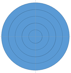
Remember that earlier tutorial where we showed you how a distance cartogram can be created in PowerPoint? We used basic shapes and the Merge Shape tool—kind of like using cookie cutters and frosting to decorate a cake. Now, you’ve got your donut-shaped structures and a tiny circle in the middle—like the sprinkles and cherry on top of your data dessert, as shown in Figure 1, below.

Figure 1: Donut shapes will help you create a cartogram
It’s time to go from “just shapes” to a real cartogram—a map that tells a story using distance and design. Think of it like building a LEGO city, where each block represents something important, and the layout shows how far things are from each other.
Ready to jazz up your distance cartogram and make it truly yours? Great! Just follow these easy-peasy steps—no rocket science required, just a dash of creativity and a sprinkle of PowerPoint magic:
- Start by placing one solid circle (think of it as your cartogram’s control center) alongside several donut-shaped rings as shown in Figure 2, below. These aren’t breakfast treats—they’re your visual building blocks! Just like planets orbiting a sun, these donut shapes will help represent distances in a way that’s easy to grasp and fun to look at.

Figure 2: All the donut shapes- Now that your donut shapes are lined up like a box of assorted treats, it’s time to give each one its own personality. Select each shape and apply a fill—kind of like icing each donut with a different color or pattern.
- In our example, we used gradient fills for all shapes, as shown in Figure 3, below. That’s like adding rainbow frosting that fades from one color to another—pretty and powerful!

Figure 3: Apply gradient fills to the donut shapes- If you want the shapes to stand apart visually, go ahead and apply outlines to each shape, as shown in Figure 4, below.

Figure 4: Apply outlines- Every great map needs a starting point, and your cartogram is no different. So, let’s add a center caption—kind of like putting a pin on a travel map that says, “You are here!”
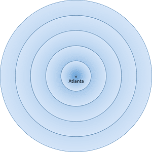
- In our example, we’re exploring air fares from Atlanta, so we dropped in a small circle (like a dot on a radar screen) and added a text box with the word Atlanta. Check out Figure 5, below, to see how it looks—simple, clear, and ready for takeoff.

Figure 5: Add a center caption- This little dot and label help anchor your whole cartogram. It’s like the center of a compass—everything else points outward from here.
- Now that we’ve got our center dot (hello, Atlanta!), it’s time to sprinkle in more circles and captions—kind of like adding rings to a tree to show its age or tossing pebbles into a pond and watching the ripples spread.
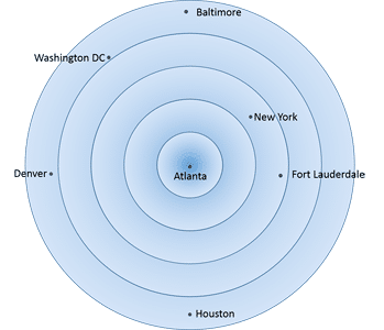
- Each donut-shaped ring you add represents $50 more in airfare. Think of it like a pricing bullseye: the farther out you go, the more it costs to fly there. Of course, your data might use a different value—so adjust your donut math accordingly. So go ahead—drop in those dots (small circles) and captions for each destination, placing them according to your data. Figure 6, below, shows how it all comes together, like a tasty chart of travel costs.

Figure 6: Add more circles and captions- Once your cartogram masterpiece is ready—donuts, dots, captions, and all—it’s time to group everything together. Think of it like bundling a bunch of balloons into one big bouquet. It keeps things neat, tidy, and easy to move around without losing a single piece.
- Alternatively, if you’re feeling extra fancy, why not add some animation? You can make shapes zoom in, captions fade out, or circles spin like a game show wheel. It’s like turning your cartogram into a mini movie—PowerPoint style!
- Save your presentation often.

