Learn how to switch data between your series and categories in PowerPoint 2011 for Mac. This option can help you swap data easily, without having to start creating a chart all over again.
Author: Geetesh Bajaj
Product/Version: PowerPoint 2011 for Mac
OS: Mac OS X
Any typical chart inserted in PowerPoint contains two types of data. One of these shows as the series within your charts, and the second data type ends up representing categories. By default, the series are shown as the individual chart elements—for example, as individual columns in a column chart. Also, the series shows up as the Legend for the chart. Categories on the other hand constitute the groups of these individual columns.
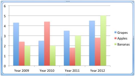
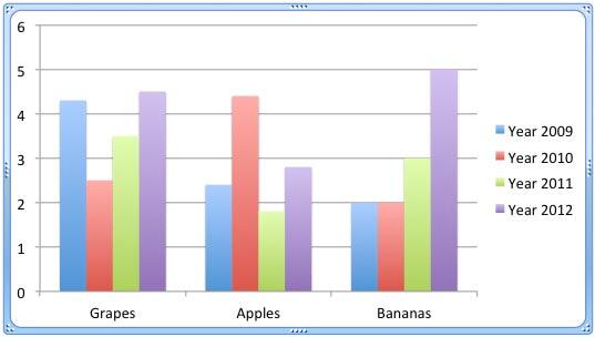
In our sample chart that you can see in Figure 1, below, the individual fruits (Grapes, Apples, and Bananas) are the series whereas the years (2009, 2010, 2011, and 2012) constitute the categories. If needed, you can quickly swap the visual representation of series and categories in the chart.

Figure 1: Chart selected
All data that works behind the scenes for any chart in PowerPoint is essentially stored in an Excel sheet. If you want to explore this data, bring up the Excel sheet that contains the data. This process is explained in our Edit Chart Data in PowerPoint 2011 for Mac tutorial. Within this Excel sheet, your data will show up in rows and columns. One of these ends up as categories for your PowerPoint chart and the other reflects as the series. There is no fixed rule about whether a row or column has to be either resulting in a category or a series. This relation can be easily switched all the time. In fact this tutorial is all about this very "switching".
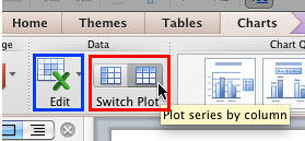
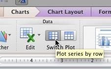
Follow these steps to swap series and categories for a chart in PowerPoint 2011 for Mac:


See Also:
Chart Data: Switch Series and Categories (Glossary Page)
Switch Series and Categories in PowerPoint 2013 for Windows
You May Also Like: Dynamic Text to Speech in PowerPoint | Wavelength PowerPoint Templates


Microsoft and the Office logo are trademarks or registered trademarks of Microsoft Corporation in the United States and/or other countries.