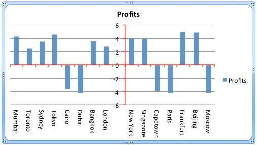
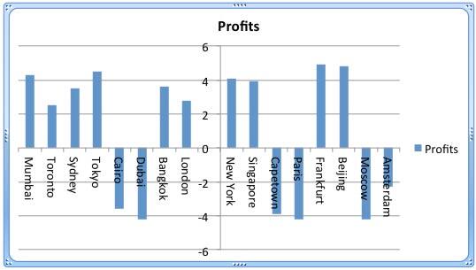
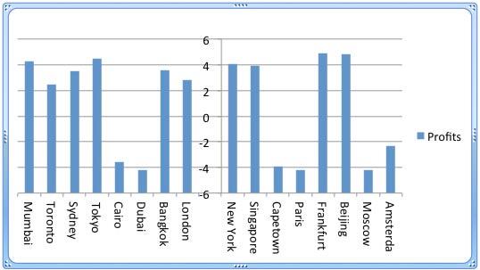
In a PowerPoint column chart, axes are typically positioned on the left and bottom of the plot area, and cross each other on the bottom left. However, there may be scenarios when your axes cross each other within the plot area itself, as shown in Figure 1, below.

Figure 1: Chart with crossed axes
Attaining such a crossed axes can be desirable due to a variety of reasons in both the value and category axes:
For Value Axes
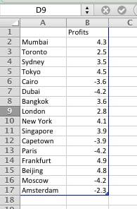
With a value axis, you may prefer this behavior when you have both positive and negative values, as is the case with the data represented in Figure 1, above. Retaining your axis at the zero level may be desirable so that negative values show below the axis, and positive values are placed above. Fortunately, you do not have to do anything to cross the value axis in such a scenario since crossing for a chart that has both positive and negative values is the default behavior. Look at the data shown in Figure 2, and you can see that it has both positive and negative values.

Figure 2: Data with both positive and negative values
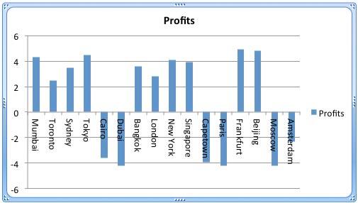
If the data shown in Figure 2, above is used to create a column chart, then PowerPoint will automatically create a chart with a crossed value axis at the zero value point, as shown in Figure 3, below.

Figure 3: Value axis is crossed at the zero value point
However, you are not limited to retaining the crossing position of the axis at zero. There's no reason why it cannot be -2 or +2, or wherever you want. Later in this tutorial, we will show you how you can alter the position where this axis is crossed.
For Category Axes
On the other hand, the reason to end up with a crossed axis for the category axis differs. You may want a crossed category axis if you have too many categories, as already shown in Figure 3, above, where we have 16 categories. In such a scenario, a leftmost placed axis may not help you ascertain column representation for data at the far right. Placing the axis in the center (see Figure 1) may provide a better solution.
Follow these steps to learn how to add crossed axes and to change the position where they cross in PowerPoint 2011 for Mac:
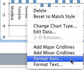
- Let us begin with the category axis. Select this axis, and right-click to bring up the contextual menu you see in Figure 4, below. Choose the Format Axis option.

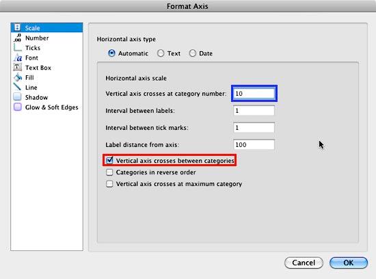
Figure 4: Format Axis option selected - Doing so brings up the Format Axis dialog box that you see in Figure 5, below. Make sure that the Scale option is selected within the sidebar. Then, make sure that the Vertical axis crosses between categories check-box is selected as shown highlighted in red within Figure 5, below.

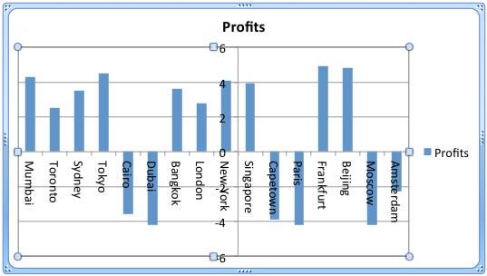
Figure 5: Change the position where the vertical axis crosses the horizontal axis - Next, within the Vertical axis crosses at category number box, highlighted in blue within Figure 5, above, type the category number before which the axis should move to. We typed in 10 for our sample data. The resultant chart can be seen in Figure 6, below, where the axis now shows between the 9th and the 10th category.

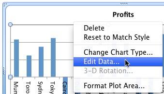
Figure 6: Value axis crossing category axis before 10th category - This solution brings forth a problem of its own. The axes labels now overlap one of the columns! To solve this problem, select and right-click any chart element and choose Edit Data in the resultant contextual menu, as shown in Figure 7, below.

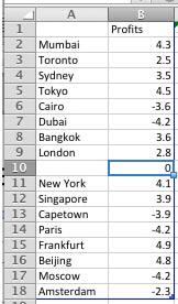
Figure 7: Select the Edit Data option - Doing so brings up the same data that we last saw in Figure 2, above. We will now insert a blank row after the 9th row, and while we leave the category name blank, we will add a zero value for the Profits column, as shown in Figure 8, below.

Figure 8: Blank row added within the Excel data sheet - The resultant chart is so much clearer. Notice the empty area that displays your category axis labels so well in Figure 9, below. Do compare with Figures 6 to see this difference!

Figure 9: A cleaner crossed axis - Now for the value axis, notice that the value axis is already at the zero level (see Figure 9), with negative values below the axis, and positive ones above. Ideally, this is exactly how this should be, so the only reason we are showing you how to change this crossed location is so that you can be aware of how to manually make this change. Select the value axis, and right-click to bring up the contextual menu, you saw in Figure 4. Choose the Format Axis option.
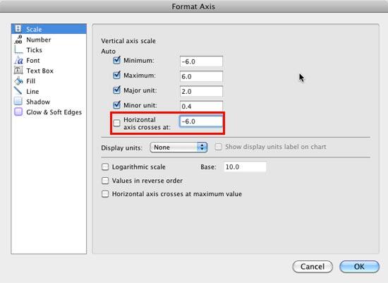
- This step brings up the Format Axis dialog box that you see in Figure 10. Make sure that the Scale option is selected within the sidebar. Also make sure that you deselect the Horizontal axis crosses at check-box to take it off Auto mode, and then enter -6 within the box as shown highlighted in red within Figure 10, below. Once done, click the OK button.

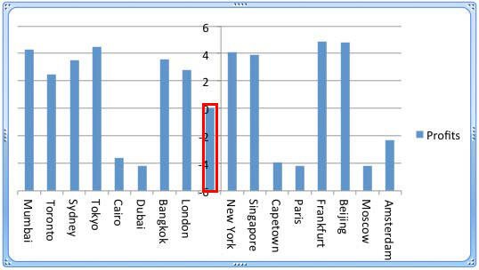
Figure 10: Change the position where the horizontal axis crosses the vertical axis - Note that since 0, the value we used for the inserted blank row (see Figure 8) is larger than our new base level of -6, it ends up displaying a column, as shown highlighted in red within Figure 11, below.

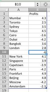
Figure 11: Data in blank row causes a new column to appear - Go back to your Excel data sheet and change the value for the blank cell to match the new base level (-6), as shown in Figure 12, below.

Figure 12: Changed data for the blank row - Doing so will make the display look better as you can see in Figure 13, below.

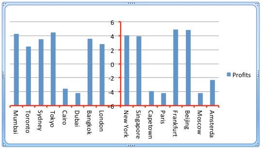
Figure 13: A cleaner crossed axis - Now that you have learned how you can change the position at which axes cross each other, you may want to make the axes more prominent by changing their color and thickness. This is easily achieved by first selecting the axis, and right-clicking (or Ctrl+clicking) to bring up the contextual menu you last saw in Figure 4, previously on this page. Choose the Format Axis option. Make sure that the Line option, highlighted in red within Figure 14, below, is selected within the sidebar. Then, select the Solid tab, highlighted in blue within Figure 14, and change the axis color.

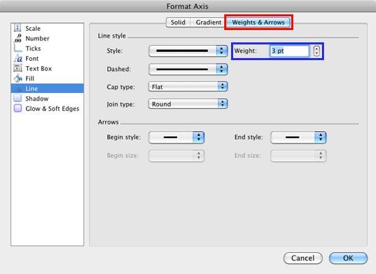
Figure 14: Change the color of the selected axis - Next, select the Weights & Arrows tab, highlighted in red within Figure 15, below, and change the thickness of the axis. As shown in Figure 15, you can see that we have changed the thickness (weight) to 3 points, highlighted in blue within Figure 15.

Figure 15: Change the line weight of the selected axis - The resultant chart will be something like what you see in Figure 16, below. And if you have crossed the value axis at zero level, you can see how this effects the resultant chart as shown in Figure 1, previously on this page.

Figure 16: Chart with formatted crossed axes - Save your presentation often.
