Learn how to use existing Excel data to create charts in PowerPoint 2013 for Windows. This process can save you time spent on needlessly duplicating data sources.
Author: Geetesh Bajaj
Product/Version: PowerPoint 2013 for Windows
OS: Microsoft Windows 7 and higher
Most users start from scratch when inserting charts in PowerPoint slides. This process brings up an instance of Excel, and indeed you can type in your own data to replace Excel's dummy data. However, what if you have existing data within an Excel sheet? Why can't you use that data to create your PowerPoint chart? Why does PowerPoint not provide an easy option to use your existing Excel sheets? Where does the sheet with all your chart data reside? And can't you bring in your own data to that sheet in a way that does not make you type everything all over again? That's a bunch of very genuine questions! This article will attempt to provide you with some answers.
The Excel sheet that contains the dummy data has no real name or location. Even though it's an Excel file, it lives as part of the PowerPoint presentation that includes a chart. So don't try looking for that Excel sheet on your computer's folders. It just doesn't exist there!
First of all, a default chart inserted in PowerPoint 2013 for Windows may look similar to the one you see in Figure 1, below.
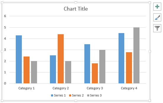
Figure 1: A new chart inserted in PowerPoint
All data that works behind the scenes for any chart in PowerPoint 2013 is essentially stored in an Excel sheet, as shown in Figure 2, below. You see this Excel sheet the first time you insert a chart.
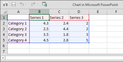
Figure 2: Dummy chart data within an instance of the Excel sheet
Want to bring up this Excel sheet that contains data after your chart has already been created? Explore our Edit Chart Data in PowerPoint 2013 for Windows tutorial.
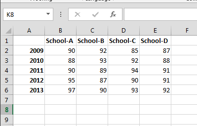
You can change dummy data to your own values manually. Even better, you can bring in data that's already on an existing Excel sheet using this step-by-step process in PowerPoint 2013 for Windows:
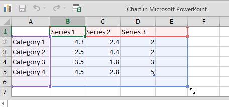
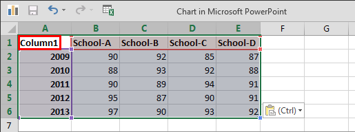
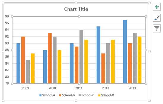
Do you see that extra column heading named Column1, shown as highlighted in red within Figure 5? This cell does not show up on the chart. If you don't want to see this text, feel free to delete it within your Excel sheet.
See Also:
Chart Data: Creating Charts Using Excel Data (Glossary Page)
Creating Charts Using Excel Data in PowerPoint 2011 for Mac
You May Also Like: 6 Reasons Why Your PowerPoint Presentations (Still) Look Boring | Biofuels PowerPoint Templates


Microsoft and the Office logo are trademarks or registered trademarks of Microsoft Corporation in the United States and/or other countries.