Learn to adjust the gap width between chart categories in PowerPoint 2011 for Mac. You may want to reduce or increase the gap width if you have too many or too few chart categories.
Author: Geetesh Bajaj
Product/Version: PowerPoint 2011 for Mac
OS: Mac OS X
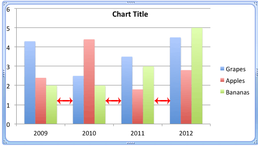
The gap width within a chart is the space between two series points, as shown with red arrows within Figure 1, below. As you can see, this gap width exists between a set of columns, which together represent a category. This gap is set to 150% of the width of individual data series (columns) by default but you can change this percentage value.

Figure 1: Chart with default gap width
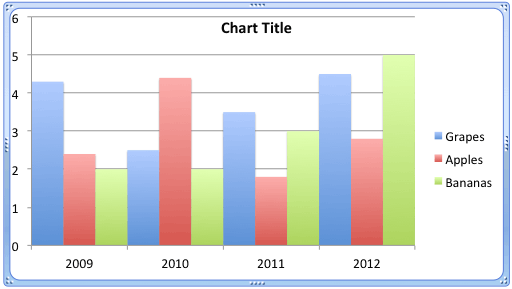
Usually the gap width is automatically calculated based on the chart data and the plot area. Thus, if you have many data series represented by thin columns, this gap width will be very narrow. The opposite is also true, and you'll see wider gap widths when there are fewer data series. Even then, there is scope for some change in the gap width. You can quickly increase or decrease this width.
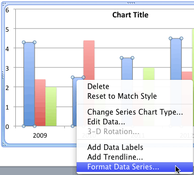
Follow these steps to explore changing the gap width between categories in PowerPoint 2011 for Mac:


See Also:
Advanced Chart Techniques: Adjust the Chart Gap Width (Glossary Page)
Adjust the Chart Gap Width in PowerPoint 2013 for Windows
You May Also Like: How to Make Your Presentation Fly | Dry Fruits PowerPoint Templates


Microsoft and the Office logo are trademarks or registered trademarks of Microsoft Corporation in the United States and/or other countries.