Test your PowerPoint slides for color-blind users, to see how they appear to them. We look at three known varieties of color-blind vision deficiencies.
Author: Geetesh Bajaj
Product/Version: PowerPoint
OS: Microsoft Windows and Mac OS X
In this tutorial, we will look at how you can create slides that are accessible to all types of color-blind users. We explore the concept of color-blindness and then show you how you can create your own, accessible slides. You can read from the beginning to the end, or choose any subtopic listed within this table of contents:
What’s the Deal with Color Blindness?
Making Slides Friendly for Everyone, Including Color-Blind Users
Contrast Matters—Big Time!
Let’s Make Your Slides Color-Blind Friendly—Fast!
Color blindness isn’t about seeing the world in black and white—well, not usually! It’s essentially a color vision deficiency. People with color blindness see colors differently and may have trouble telling certain ones apart.

Here’s the kicker: Most cases of color blindness are inherited. Yep, you can thank (or blame) your genes for it! But it’s not just about family traits—it can also happen if there’s damage to your eye, the optic nerve, or even the brain.
The bad news? There’s no surefire way to fix color blindness yet. It’s just one of those things that you learn to work around, whether it’s with color-coding tricks or special tools like color-filtering glasses. Fortunately, you can do so much by creating visual content that is more suitable and accessible for color-blind users. More information on color blindness can be found on Wikipedia.
BackWeb designers have spent loads of time and effort figuring out how to make websites easier to use for color-blind folks. Awesome, right? But here’s the kicker: slides—like the ones you whip up in Microsoft PowerPoint—haven’t gotten nearly the same love.
When someone with color blindness checks out a PowerPoint slide, they don’t see it the same way as everyone else. Colors that seem super clear to most people can look almost identical—or totally invisible—to them. That cool color-coded chart you spent hours perfecting? It might just look like a big blur of sameness to a color-blind viewer. Figure 1, shown later on this page will give you an idea of what color-blind folks are looking at.
So, what can you do? Think about accessibility when designing your slides—your audience will thank you for it!
Here’s a fun fact: Even two people with color blindness might see the exact same PowerPoint slide completely differently. Surprised? It’s because color blindness isn’t just one thing—it comes in three main flavors (fancy term: varieties):
This is the most common form of color blindness. Reds and greens get muddled together, making it tricky to tell them apart.
Slide Tip: Test your slide with color-blind simulators (we discuss them later on this page) to make sure those pie chart slices don’t all blend together.
People with protanopia have trouble distinguishing reds from greens. Red can look dark, even black, while green might not stand out like it does for others.
Slide Tip: Avoid red-green combinations for charts, graphs, or important labels. Try using contrasting patterns, shapes, or clear labels instead.
This one is rarer and affects blues and yellows, sometimes making it hard to distinguish between them or causing blues to appear greenish.
Slide Tip: If you love using blue and yellow in your designs, throw in some texture or bold outlines to make elements distinct for everyone.
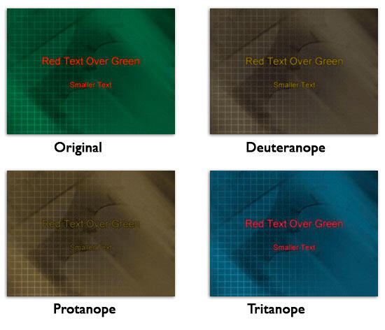
Figure 1, below, shows an original slide with three variations: one each for how a person affected with Deuteranope, Protanope, and Tritanope types of color vision deficits views the same slide. And of course, the first variation (top left) shows the original slide as it would be viewed by people who do not have color vision deficiencies.

Figure 1: Results for various types of color vision deficiencies
Think the contrast in Figure 1, above is okay-ish? Well, hold onto your hat, because Figure 2, below, takes things to a whole new level of “hard to read.”

Figure 2: More results for different color vision deficiencies using red-green combinations
Here’s what we did: we swapped the text color from white to red but left the background unchanged. The result? Let’s just say it’s not winning any readability awards. The smaller text practically disappears, and what you can see isn’t exactly easy on the eyes.
If you see the contrast values in the slide samples within Figure 2, you must have realized how important it is to make sure that your PowerPoint slide content has enough contrast so that it can be effectively viewed by those who have visual disabilities. Contrast isn’t just a nice-to-have—it’s a must-have! If your text and background colors don’t play nice together, your audience won’t be able to read your slides, no matter how brilliant your content is.
Here’s a quick snapshot (Source: Wikipedia):
The takeaway? Men are far more likely to be color-blind, no matter where you are! Many more studies have been done on this subject.
Ready to make your slides a hit with everyone, including color-blind viewers? We’ve got you covered with some quick and easy tips to get it right every time! This process entails two processes: first, you save slides as pictures, and next you check them in an online service. Learn more in our Running Color Blind Test Using Images Exported from PowerPoint page.
BackStick to high-contrast combinations like dark blue and white or black and yellow. Avoid red and green together—they’re hard to distinguish for many. Use textures or patterns with colors to help differentiate items. Accessibility isn’t just thoughtful; it’s professional!
PowerPoint doesn’t have a built-in checker, but tools like Color Oracle or Coblis simulate color blindness. Save your slide as an image and test it there. Alternatively, ensure all critical information isn’t dependent on color alone—use labels or icons too!
Use clear text labels and strong contrasts. Replace color-only keys with patterns, icons, or labels. For graphs, use different shapes (e.g., bars with stripes vs. solid) instead of relying on colors. Simple, clear slides work best for everyone!
18 01 01 - Color-Blindness: PowerPoint Slides for Color-Blind Audiences (Glossary Page)
You May Also Like: Presentation Skills for Introverts: Conversation with Nancy Ancowitz | Traffic PowerPoint Templates


Microsoft and the Office logo are trademarks or registered trademarks of Microsoft Corporation in the United States and/or other countries.