![]()
This is the print version of this page. All content is copyright Indezine.com 2000-2026.
![]()
Learn about six new chart types available in PowerPoint 2016 for Windows.
Author: Geetesh Bajaj
Product/Version: Microsoft PowerPoint 2016
OS: Windows 7 and higher
Frankly, it has been many years since new chart types were added to PowerPoint’s repertoire of the ten chart types. The great news is that you will find new chart types in PowerPoint 2016 for Windows. These are:
To locate these new Chart types, click the Insert tab of the
Ribbon as shown highlighted in
green within Figure 1 below, and select the Charts option (highlighted in
blue within Figure 1). This opens the Chart Types dialog box
where you can see the new charts, as shown highlighted in red within Figure 1.

Figure 1: New Chart Types in PowerPoint 2016 for Windows
Let's explore each of these six new chart types:
The Treemap chart provides a hierarchical view of your data, categorized similar to the branches and leaves of a tree. This provides an
easy way to compare different levels of categorization. Look at Figure 2, which shows a sample Treemap chart.

Figure 2: Treemap chart
The new Sunburst chart shows the full hierarchy of categories to provide deeper analysis capabilities. This chart type
makes it easy to find out the largest contributing sections within a hierarchy of multiple levels. Look at Figure 3, which
shows a sample Sunbrust chart.
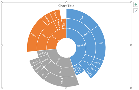
Figure 3: Sunbrust Chart
Suitable for statistics, a histogram automatically displays the frequencies within a distribution, as
shown in Figure 4, which shows a sample Histogram chart.
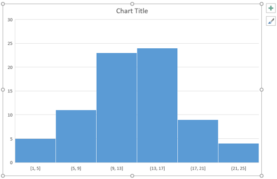
Figure 4: Histogram chart
Pareto chart type, a sub-type of Histogram chart, helps you automatically sort the frequency of the most common issues (represented by
the bar graph) and then show the percentage of contribution of each issue as you move along the horizontal axis (the line graph). See
Figure 5, which shows a sample Pareto chart.
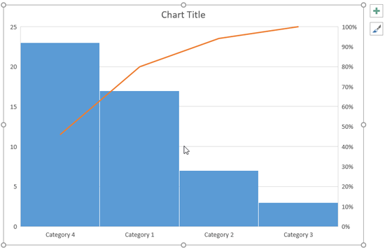
Figure 5: Pareto chart
A Box & Whisker chart illustrates the distribution of data into ‘quartiles’, emphasizing the mean and outlier values.
See Figure 6, which shows a sample Box & Whisker chart.
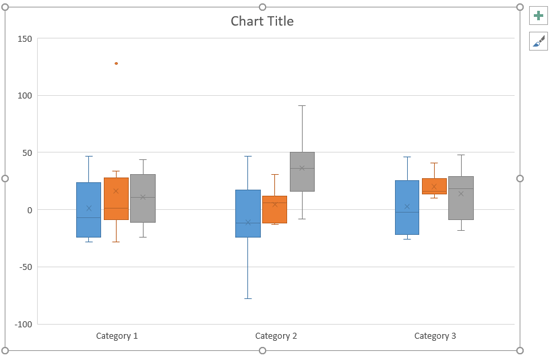
Figure 6: Box & Whisker chart
With the help of Waterfall charts you can quickly find out and understand the gains and losses caused by each item.
See Figure 7, which shows a sample Waterfall chart.
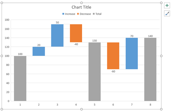
Figure 7: Waterfall chart
Microsoft and the Office logo are trademarks or registered trademarks of Microsoft Corporation in the United States and/or other countries.