
This is the print version of this page. All content is copyright Indezine.com 2000-2026.
Make sure that you know whether you must create widescreen or standard slides for your next presentation.
Author: Geetesh Bajaj
Product/Version: PowerPoint
Choosing between widescreen and standard slides isn’t just a design decision. It directly affects how clearly your audience can read your content. This page explains why aspect ratios matter, how projection mismatches shrink your visuals, and what you can do to ensure your slides always look crisp, readable, and perfectly framed.
Readability Isn’t Optional
A Tale of Two Rectangles
So, Is 4:3 Actually Dead?
What Should You Actually Do?
The Bottom Line
Quick Quiz
Picture this. You're on a webinar, watching from your phone. The presenter puts up a slide full of numbers. Lots of numbers. Tiny numbers. You squint. You lean in. You still can't read them. A few months earlier, the same thing happened to you at a conference, except this time you were sitting in a real room with a real screen. The text wasn't even that small, 20 points, nothing outrageous. And yet, from your seat, it might as well have been printed in fine print on a pill bottle.
Here's the twist. In neither case was the presenter careless. The real culprit was something far less obvious: somebody had built a Widescreen (16:9) slide and then projected it onto a Standard (4:3) screen. The slide didn't just look a little off. It effectively shrank itself to fit into a shape it was never designed for, taking your text down with it.
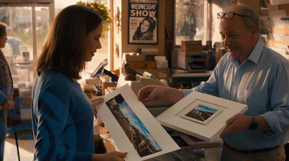
Think of it like handing a print shop a wide, panoramic photo, but the shop only stocks square photo paper. Rather than slice off the sides to force it to fit, they shrink your entire photo down so the whole image fits inside the square, leaving blank matting above and below. Nothing gets cut off, but the photo you get back is noticeably smaller than it could have been if the paper matched its shape.
That, in a nutshell, is the aspect ratio trap. And even while updating this page in 2026, with widescreen everywhere you look, it's a trap that's remarkably easy to fall into.
BackPowerPoint gives you two main shapes to build your slides in:
The 16:9 ratio wasn't a random design choice. In 1984, engineer Kerns Powers at the Society of Motion Picture and Television Engineers cut out paper rectangles matching all the popular film and TV ratios of the day, from boxy old 4:3 broadcasts to ultra-wide CinemaScope. He stacked them on top of each other, centered, and found a shape that fit them all reasonably well without wasting too much space on any of them.
That shape worked out to almost exactly 16:9, mathematically the geometric mean between 4:3 and the widest cinema ratios of the era. Four decades later, it's the shape of nearly every screen on Earth, and a fair chunk of that credit belongs to a man with scissors and graph paper.
PowerPoint itself only switched its default slide size to Widescreen (16:9) with PowerPoint 2013. Before that, every new presentation you opened defaulted to boxy old Standard 4:3, whether you wanted it or not.
Now here's where Figure 1, below, earns its keep. Look at the four thumbnails below. The two on the left show actual Standard (4:3) and Widescreen (16:9) slides. The two on the right show what happens when each one hits a Standard (4:3) projection screen.
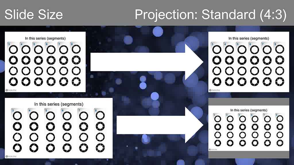
Figure 1: Slides projected on a standard projection
The Standard slide on the Standard screen is a perfect fit, like a photo that exactly matches its frame. But the Widescreen slide on that same Standard screen? You get ugly empty bands above and below it, non-slide real estate that's doing nothing for you. That wasted space eats up roughly a quarter of your screen. And the bigger problem hiding underneath: everything on your slide, text included, shrinks right along with it.
Flip the scenario and you get a mirror image of the same headache, which is what Figure 2, below, shows.
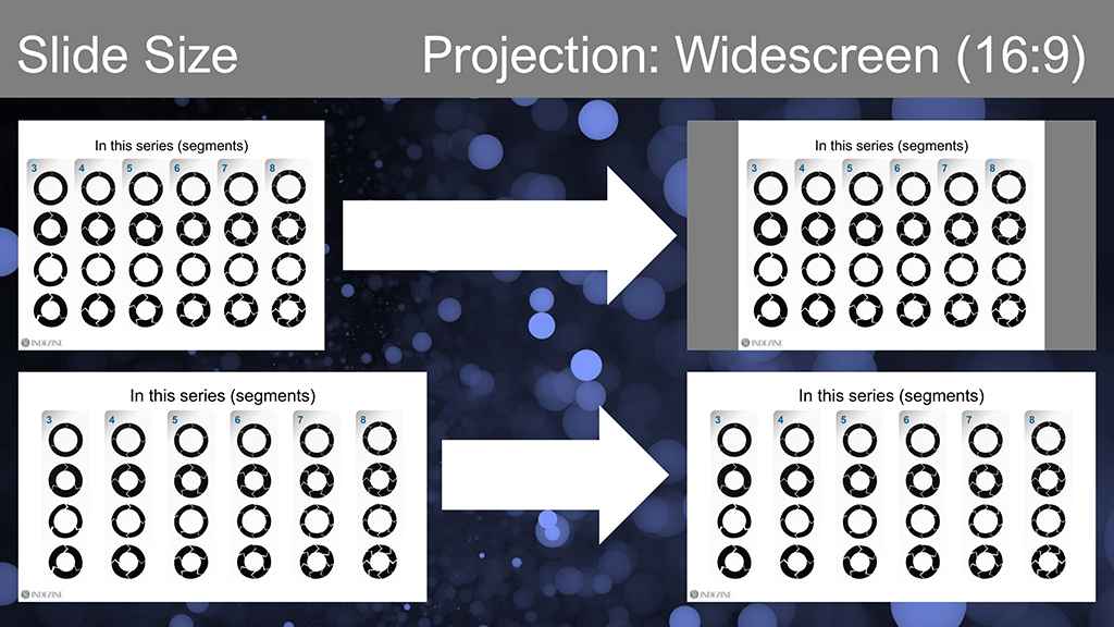
Figure 2: Slides projected on a widescreen projection
A Widescreen slide on a Widescreen screen fills the frame beautifully. But project a Standard (4:3) slide on that same Widescreen (16:9) screen, and now you've got empty columns on the left and right instead of top and bottom. You still lose about a quarter of your screen. The silver lining here is that your text doesn't shrink the way it does in the first scenario, so readability holds up better. Small mercy, but a real one.
BackMostly, yes. Widescreen has been PowerPoint's default for over a decade, and most projectors, monitors, and displays sold in recent years are natively 16:9 or close to it. If you're designing for a typical modern conference room, laptop screen share, or hybrid meeting setup, Widescreen is the safe, sensible default.
But "mostly dead" isn't "dead," and 4:3 still turns up in a few specific corners worth knowing about:
Think of 4:3 Standard today less like an extinct species and more like an animal that's rare but not gone. You probably won't run into it, but you should still know what its tracks look like.
BackThis brings us to the larger question. What should you do, so as to not encounter these problems? Here's your action plan, no unnecessary drama required:
Hopefully these guidelines will help. Feel free to share your thoughts in the comments below.
BackAspect ratio mismatches are one of those problems that are entirely avoidable and yet keep happening anyway, quietly wrecking readability while everyone in the room assumes the presenter just used tiny text. A two-minute check on the venue's equipment, or a backup file in your bag, is all it takes to dodge it.
BackThis article was first written on May 29, 2015, substantially rewritten and updated on June 25, 2020, and refreshed again in August 2026.
You May Also Like: Change PowerPoint Slide Size, and You Lose Fonts, Backgrounds, and Colors!


Microsoft and the Office logo are trademarks or registered trademarks of Microsoft Corporation in the United States and/or other countries.
