Explore Prisma, a multilined font that is best suited for heading text.
Author: Geetesh Bajaj
Product/Version: PowerPoint
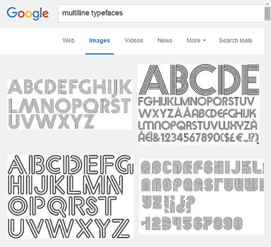
Multiline typefaces typically have several parallel lines and are best suited for heading text. Even better, these work well when the text is placed above a picture or textured background, as long as the visual is not too crowded.
A quick search on Google Images displays how multiline typefaces look like, as illustrated in Figure 1, below.

Figure 1: Multiline typefaces
In Figure 2 below, you can see one such multiline font. The font used here is Prisma, and it is one of the fonts created in the last century by Rudolf Koch, a German type designer who also designed other famous typefaces such as Kabel and Neuland - both of these were not multiline though!

Figure 2: Prisma Font
 Rudolf Koch lived in Germany. He was an exceptionally talented type designer who was also involved with lettering, calligraphy, typography and illustration. Most of his typefaces were created for the Klingspor Type Foundry including his most widely used typefaces, Neuland and Kabel.
We found Prisma in Esquire magazine’s UK edition, and they did use Prisma for headings very well. The best quality of Prisma is that it always looks contemporary even though it is from the last century! See the following three examples from the magazine.
Do you want to see more examples of Prisma being used over the years? Head to the Prisma page on the Fonts in Use site.
Here’s how we used Prisma for a quotation slide:

You can get a free version of Prisma from dafont.com.
MyFonts has a Pro version of Prisma as well as the similar looking, similar sounding Prism font.
You May Also Like: Make Your Meetings Productive: Ask These 5 Questions | Portugal Flags and Maps PowerPoint Templates


Microsoft and the Office logo are trademarks or registered trademarks of Microsoft Corporation in the United States and/or other countries.